Wired for the Wrong Season: How Designers Get Trapped by Emotional Shortcuts
Photo: Jordanhill School D&T Dept, CC BY 2.0, via Wikimedia Commons
There's a mood board somewhere right now — probably dozens of them — where someone has pinned burnt orange next to a cozy knit blanket and labeled the whole thing "autumn vibes." Nobody told them to do it. Nobody had to. The association was already there, pre-loaded like factory settings on a new device.
That's the problem.
Designers talk a lot about intuition, about trusting your eye, about developing a personal visual language. But underneath a lot of that intuition is a surprisingly rigid emotional rulebook. Warmth equals fall. Cold equals winter. Softness and bloom equal spring. Harshness, glare, and saturation equal summer. These aren't laws of nature. They're learned behaviors — and they're quietly flattening some of the most interesting creative work happening right now.
The Neuroscience Behind the Shortcut
Synesthesia, in its clinical definition, is a neurological phenomenon where stimulation of one sense automatically triggers a response in another — some people genuinely hear colors or taste sounds. But designers exist in a kind of cultural synesthesia, one that's been constructed over generations rather than wired into individual brains.
Research in color psychology has long established that humans assign emotional weight to hues. Reds and oranges register as energetic and warm. Blues and grays read as calm or melancholy. These responses have some biological grounding — our nervous systems do respond to wavelengths of light in measurable ways. But the seasonal layer on top of that? That's almost entirely cultural.
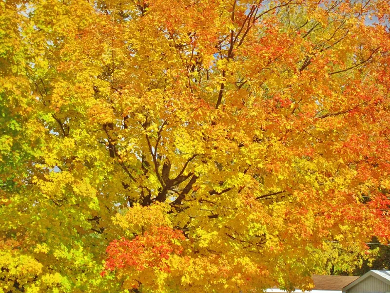
Think about how many times you've seen a Thanksgiving ad, a Halloween campaign, a fall fashion lookbook, or an autumn-themed app interface all pulling from the same amber-rust-gold palette. By the time you're a working designer in your mid-twenties, you've absorbed thousands of those associations. Your brain doesn't just recognize the pattern — it anticipates it. It expects it. And expectation, in creative work, is the enemy of surprise.
The Comfort of Convention
Here's where it gets interesting: designers often defend these seasonal emotional shortcuts as serving the audience, not themselves. "People feel warmth when they see orange in October," the argument goes. "I'm just meeting them where they are."
And honestly? That's not entirely wrong. There's real value in shared visual language. Communication depends on it. If you're designing a holiday campaign for a mid-size retail brand in the Midwest, leaning into established seasonal cues is often the most efficient path to emotional resonance.
But efficiency and authenticity aren't the same thing. And when every designer in every vertical reaches for the same emotional shorthand at the same time of year, the result isn't resonance — it's wallpaper. It blends in. It becomes invisible precisely because it's so expected.
The more honest question isn't "what do people expect from this season?" It's "what do I actually feel about this season, and how might that be different from what everyone else is showing?"
What Happens When You Break the Pattern
Some designers have started deliberately working against seasonal emotional conditioning, and the results are genuinely striking.
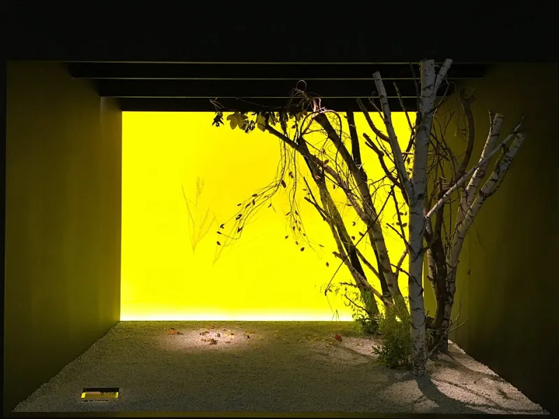
Consider the growing wave of winter campaigns that lean hard into warmth — not the fake, manufactured warmth of a stock photo fireplace, but saturated terracottas, deep magentas, and sun-scorched yellows applied to December content. The dissonance is immediate. Your brain flags it. And then, if the execution is strong enough, something else kicks in: curiosity.
Or look at spring-themed work that strips out the soft pastels entirely, replacing them with stark black-and-white photography and brutalist typography. The emotional message shifts from "renewal" to "clarity" — which is, arguably, what spring actually feels like after a long winter. Not soft. Sharp. Blinding.
These aren't arbitrary provocations. They're designers asking a more precise question: What is this season actually like, separate from what we've agreed to say about it?
A Framework for Escaping the Defaults
If you want to start working against your own seasonal conditioning without just making things weird for the sake of it, a few practical approaches can help.
Start with sensation, not symbol. Instead of asking "what colors represent fall?" ask yourself what fall physically feels like — the specific quality of afternoon light in early October, the particular smell of cold air after rain, the way dry leaves sound underfoot. Translate those sensory details into visual decisions rather than reaching for the palette you've already seen a thousand times.
Run a contrast audit on your mood boards. Before you commit to a seasonal direction, pull together five to ten examples of work you admire from the same season and look at what they have in common. Then deliberately choose one element — color, texture, typography weight, composition — and go in the opposite direction. See what that unlocks.
Separate mood from season. This one's subtle but powerful. Ask yourself: what's the actual emotional tone I'm trying to create? Nostalgia? Unease? Clarity? Tenderness? Then ask: does this season have to carry that emotion, or is that just habit? A winter piece can carry tenderness. A summer piece can carry grief. A spring piece can carry dread. The season is a setting, not a feeling.
Steal from the wrong season on purpose. Take a summer color palette and apply it to a winter concept. Take a fall texture — rough bark, dried leaves, cracked earth — and use it in a spring piece. The friction between expectation and execution is where interesting things happen.
The Deeper Issue
What's really at stake here isn't just visual originality. It's honesty.
When designers default to the same emotional shorthand season after season, they're not just being unoriginal — they're participating in a kind of collective fiction about what these times of year actually mean. Fall isn't always cozy. Winter isn't always bleak. Spring isn't always hopeful. Summer isn't always carefree. These seasons contain multitudes, and the design world has been quietly editing most of those multitudes out.
There's something worth recovering in that complexity. The most resonant creative work tends to find the specific, lived truth of an experience rather than the agreed-upon version of it. Seasonal work is no different.
The amber palette isn't the problem. The problem is reaching for it without asking whether it's actually true — true to the project, true to the moment, true to whatever you're actually trying to say.
Breaking out of the synesthesia trap doesn't mean rejecting seasonal visual language altogether. It means holding it loosely enough that you can put it down when something more honest comes along.