Fall Stole the Show: How Autumn's Visual Language Became Every Season's Default Setting
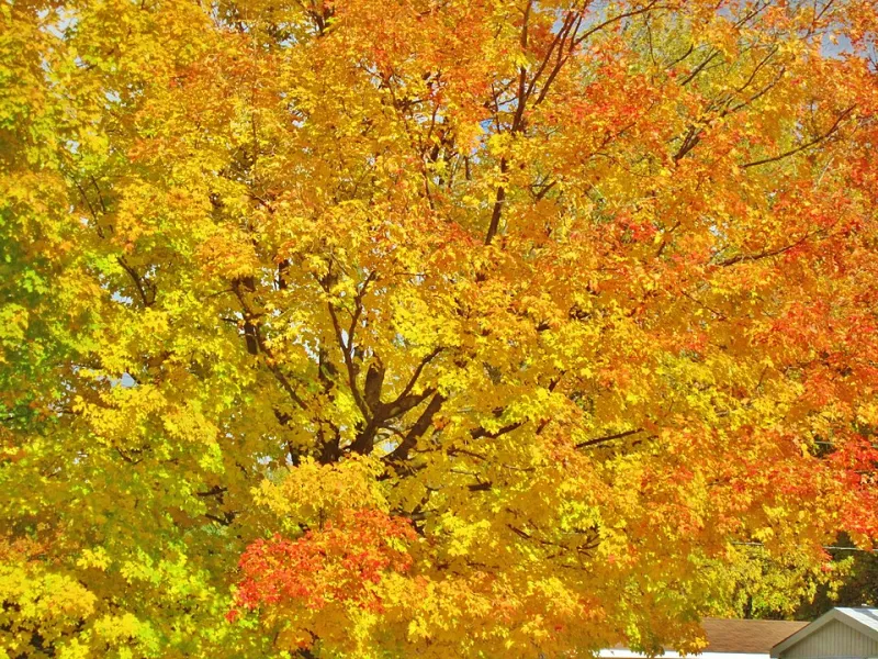
Photo: Richard Mc Neil, CC BY 3.0, via Wikimedia Commons
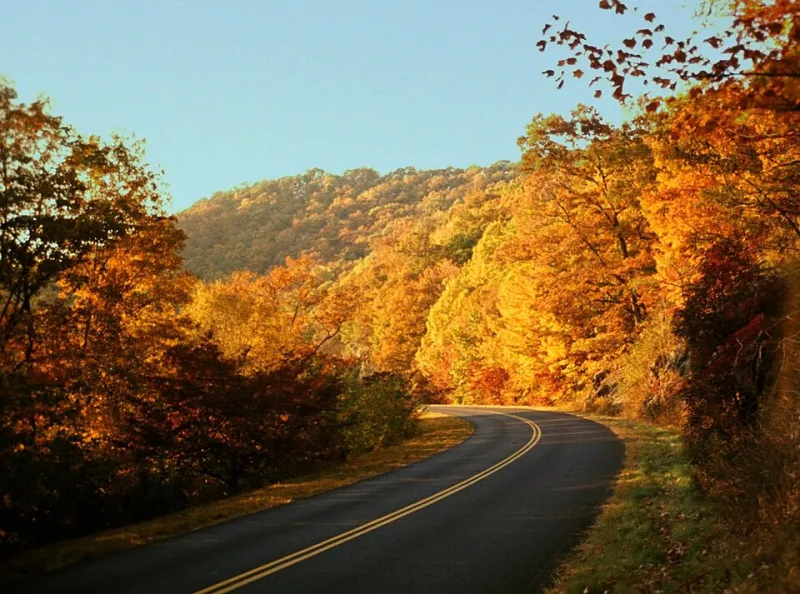
Open a design portfolio from a Brooklyn studio in April. Scroll through a summer campaign for a luxury skincare brand. Flip through the spring lookbook for an artisan coffee roaster. Odds are, somewhere in all of that, you're going to find burnt sienna. You're going to find deep ochre, dried-leaf textures, or that particular low-contrast warmth that reads — unmistakably — as fall.
Except it isn't fall. It's May. Or July. Or the literal first week of spring.
Something strange has happened in contemporary design over the past decade or so. Autumn's visual language — its palette, its textures, its emotional register — has quietly detached itself from the calendar and colonized the aesthetic landscape year-round. What started as a seasonal mood has become a permanent design default, and a lot of people in the industry are only now starting to notice.
The Palette That Ate the Calendar
There's a reason autumn aesthetics feel "sophisticated." The warm, desaturated tones of fall sit in a perceptual sweet spot: they're rich without being aggressive, nostalgic without being kitsch, and they photograph beautifully in the kind of diffused natural light that Instagram and editorial photography have trained us to love.
The problem is that those same qualities have made autumn's palette almost too useful. Designers reach for it the way a writer reaches for an em dash — because it works, reliably, in almost any context.
"There's a reason we call certain color combinations 'timeless,'" says one creative director at a mid-sized brand consultancy in Chicago who asked not to be named. "But I've started to wonder if 'timeless' is just a polite way of saying we're not willing to take the seasonal risk. Autumn colors read as premium, as considered. So everyone uses them, all year, and nobody questions it."
That quiet ubiquity is exactly what makes it worth questioning.
Brand Campaigns and the Borrowed Season
Look at the major brand refresh cycles of the last five years and a pattern becomes hard to ignore. Lifestyle brands launching spring collections have leaned into warm, earthy photography that wouldn't look out of place on a Vermont foliage tour. Summer wellness campaigns have swapped the expected blues and greens for dusty pinks and warm neutrals that carry an unmistakably autumnal emotional weight.
This isn't accidental. Design teams are responding to what performs. A/B testing, engagement metrics, and years of consumer data have collectively pointed toward warmth, depth, and a particular kind of organic imperfection — all of which autumn delivers more naturally than any other season.
The result is that spring and summer campaigns increasingly communicate through autumn's emotional grammar even when their subject matter is technically sun-soaked and light-filled. The visual language and the actual content have come uncoupled.
"We pitched a full spring campaign in 2022 that was genuinely light and airy — greens, soft yellows, real seasonal energy," recalls a senior designer at a Portland-based agency. "The client loved the concept but kept pushing us toward warmer tones during revisions. By the final version, it looked like a fall campaign with flowers in it."
Nostalgia as a Design Crutch
Part of what's driving this isn't aesthetic preference at all — it's emotional infrastructure. Autumn has a uniquely powerful nostalgic pull in American culture. Back-to-school, harvest festivals, Thanksgiving, the particular melancholy of shorter days — fall is loaded with collective memory in a way that summer and spring simply aren't.
When designers reach for autumn's visual language outside of its season, they're often reaching for that emotional payload. It's a shortcut to depth, to feeling, to the sense that something matters.
That's not inherently cynical. But it does raise a real creative question: if we're borrowing autumn's emotional resonance to make spring content feel more meaningful, what does that say about how we actually feel about spring?
"There's something a little exhausted about it," says a freelance brand strategist based in Austin. "Like we've collectively decided that warmth and decay are the only visual language that communicates seriousness. It's nostalgia dependency. We're using fall as a shorthand for 'this is real and it matters' because we haven't done the work of figuring out what spring or summer sound like when they're trying to say the same thing."
What Gets Lost in the Translation
The irony is that autumn's visual power was always rooted in contrast — the specific emotional charge of watching something beautiful in the process of ending. That bittersweet quality is what gives the palette its depth. Stripped of its seasonal context and applied generically to a June product launch or a February rebrand, that depth doesn't fully transfer. What remains is just the color.
And color without context eventually becomes wallpaper.
Some designers are pushing back deliberately. There's a growing contingent — particularly among younger creatives who came up in the maximalist, high-saturation world of social media design — who are actively reclaiming the visual languages of other seasons. Vivid greens. Harsh summer whites. The flat, grey-blue quiet of actual winter.
"I've started treating autumn as a restricted palette in my work," says one independent designer based in Nashville who goes by the handle @coldframestudio on Instagram. "Not because I don't love it — I do — but because I realized I was defaulting to it for everything and it was making my portfolio feel like one long September."
The Aesthetic Colonization Problem
There's a larger design conversation buried inside all of this. When one aesthetic framework becomes so dominant that it absorbs and overwrites others, the field loses something real. Seasonal visual language exists, in theory, to help us locate ourselves in time — to anchor images and objects in a specific, felt experience of the world.
When autumn's palette gets applied to every season, that anchoring dissolves. Design becomes seasonally homeless, floating in a permanent amber haze that feels sophisticated but doesn't actually tell us anything about when we are or how it feels to be here.
That might sound like a minor loss. But for a field that's fundamentally about communication — about making people feel specific things at specific moments — it's worth sitting with.
Autumn's visual language is genuinely extraordinary. The palette earned its cultural dominance. But extraordinary things tend to get overused, and overuse is its own kind of corruption. The question worth asking isn't whether autumn aesthetics are beautiful. They are. The question is whether we've gotten so comfortable borrowing them that we've forgotten how to speak in any other season's voice.