Stuck in October: Why Autumn Aesthetics Keep Hijacking Your Off-Season Creative Work
Photo: Jordanhill School D&T Dept, CC BY 2.0, via Wikimedia Commons
Open any design portfolio right now. Scroll through Behance, Pinterest, or the feeds of your favorite creatives. Odds are good you'll find warm amber gradients, textured paper overlays, and that unmistakable palette of rust, sage, and deep terracotta — regardless of when those projects were actually made. It's a pattern that's hard to unsee once you notice it, and honestly, it's worth talking about.
Fall is arguably the most visually photogenic season. Designers and photographers know this. But somewhere along the way, autumn stopped being a seasonal reference and became a year-round creative default. The question is: why? And more importantly, is leaning on it actually hurting the work?
The Psychology Behind the Pull
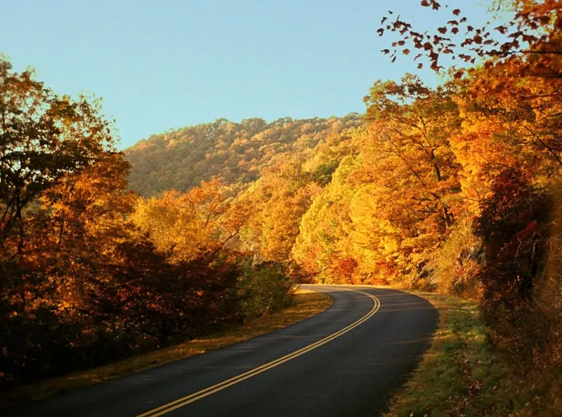
There's real neuroscience behind why autumn imagery feels so emotionally resonant. Warm earth tones — ochres, burnt oranges, deep reds — activate the same psychological comfort responses associated with warmth, safety, and familiarity. Researchers have long noted that humans are drawn to environments that signal shelter and abundance, and fall's color story taps directly into that wiring.
Beyond biology, there's nostalgia doing heavy lifting here. For most Americans, autumn is the season most densely packed with emotional memory. Back-to-school energy, Halloween costumes, Thanksgiving gatherings, that specific smell of cold air and dried leaves — fall is practically a greatest hits album of childhood sensory experience. When a designer reaches for those visual cues, they're not just choosing a color palette. They're borrowing an emotional shortcut.
And shortcuts, as every creative professional knows, are both a gift and a trap.
When Comfort Becomes a Crutch
The problem isn't that autumn aesthetics are beautiful — they genuinely are. The problem is when they become the path of least resistance for every single project, regardless of context. A spring wellness brand doesn't need dried pampas grass and a muted terracotta color story. A summer lifestyle campaign doesn't need moody, low-contrast photography that feels like it was shot on a foggy November morning in Vermont.
Yet these choices show up constantly in commercial design work, and clients often don't push back because — here's the kicker — they find it comforting too. The designer defaults to what feels emotionally safe, the client responds positively to the familiar warmth, and the project ships. Everyone feels okay about it. But the work doesn't actually serve the brand's moment in time.
There's also a homogenization effect worth naming. When every creative across every platform is reaching for the same visual vocabulary, the work starts to blur together. That handcrafted serif on a kraft paper texture? You've seen it a hundred times. The dried flower flatlay on a warm linen background? Same. These aren't bad design choices in isolation — they're just choices that have been made so frequently that they've lost their ability to surprise or communicate anything specific.
The Commercial Design Machine Loves Fall
Part of why autumn aesthetics dominate year-round is structural. The commercial design industry runs on content calendars that are perpetually three to six months ahead of the actual date. By the time summer is happening, designers are already deep in fall campaign territory. By the time spring arrives, they're mentally in late summer or early autumn prep.
This forward-planning rhythm means creatives spend a disproportionate amount of their actual working hours inside autumn's visual world. The season gets more creative real estate than any other, which means more refinement, more iteration, and ultimately more polished output. It's no wonder those assets and aesthetics become the benchmark everything else gets measured against.
Add to that the fact that Q4 — the season bookended by fall — is the highest-revenue quarter for most consumer brands. More budget means more ambitious creative work, which means the most technically impressive and emotionally resonant campaigns tend to be autumn ones. Creatives internalize that standard and unconsciously try to replicate it in lower-stakes seasonal work.
Breaking Out of the Amber Loop
So how do you actually escape this pattern? A few approaches worth trying:
Seasonal immersion before you open a single design tool. Before your next spring or summer project, spend deliberate time inside that season's actual sensory world. Go outside. Look at what light does in June versus October. Notice the specific quality of summer shadows, the way green foliage creates a completely different kind of depth than bare branches. Let your eyes recalibrate before you let your muscle memory take over.
Build season-specific mood boards from scratch. Don't pull from your existing archive. Collect references that are genuinely tied to the current or intended season — not just recolored versions of what you already know. This means actively seeking out design work, photography, and art that feels authentically rooted in spring or summer, even if it's harder to find.
Challenge the warmth assumption. Not every design needs to feel cozy. Summer design can be sharp, bright, even slightly harsh in a way that feels honest to the season. Spring can be strange and a little chaotic — things are literally erupting out of the ground. Leaning into those less-comfortable seasonal truths can produce work that feels genuinely alive.
Name the default when you see it. When you're reviewing your own work-in-progress and you notice that familiar warm-textured drift starting to happen, just call it out. Even just labeling it — "this is the fall reflex kicking in" — creates enough distance to make a more intentional choice.
Being Present in Your Own Work
Ultimately, the nostalgia trap in design is really a presence problem. Autumn aesthetics feel safe because they're deeply familiar, emotionally loaded, and commercially proven. Designing for the actual current season requires being genuinely present — paying attention to what's happening outside right now rather than what felt right in your best project from two Octobers ago.
The most compelling creative work tends to feel like it could only have been made in a specific moment. It has a kind of temporal honesty that resonates even when you can't quite name why. Chasing that quality means being willing to step out from under the amber glow occasionally and see what else is out there.
Fall will always be waiting for you when October comes around. But right now? There's a whole other season that deserves your full attention.