Burned In: Why Rust, Ochre, and Amber Keep Haunting Our Design Choices Year-Round
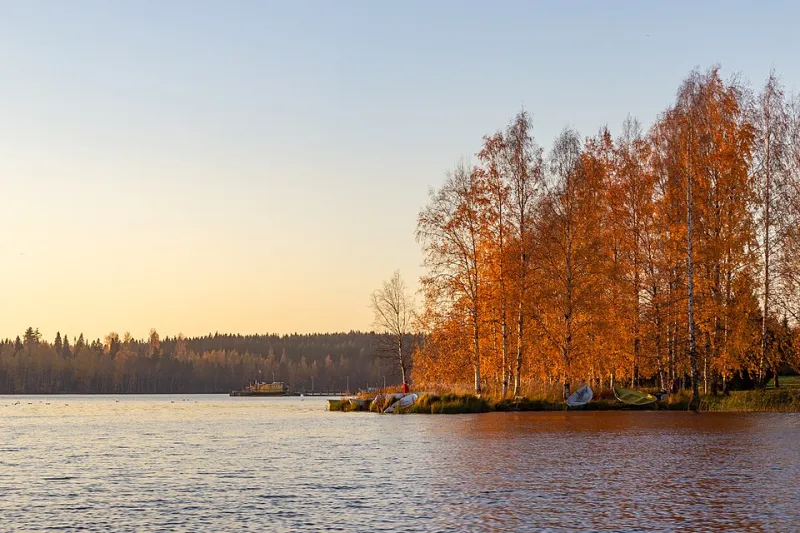
Photo: Unknown authorUnknown author or not provided, Public domain, via Wikimedia Commons
It's July. Ninety degrees in Phoenix, humid and miserable in Chicago, peak beach season in the Carolinas. And yet, scroll through Dribbble or Behance right now and you'll find warm rust tones in a fintech rebrand, deep amber in a wellness app UI, and burnt sienna anchoring a fashion campaign that has nothing to do with leaves or harvest festivals.
Autumn colors don't wait for autumn anymore. They never really did.
The question worth asking isn't why designers reach for ochre in October — that's obvious enough. The more interesting question is why those same tones keep showing up in February, in May, in the dead of summer. What is it about the color language of fall that makes it feel perpetually relevant, perpetually safe, perpetually alive?
Color Has Always Been Emotional Before It's Been Aesthetic
Designers talk about color psychology the way doctors talk about nutrition — everyone knows the basics, but the deeper mechanisms are murkier than the talking points suggest. We know red signals urgency. Blue communicates trust. Green lands as natural or financial depending on context. These associations are real, but they're also flattened versions of something more complex.
Autumn tones occupy a particularly layered emotional space. Rust, ochre, amber, deep terracotta, burnished gold — these colors sit at the intersection of warmth and weight. They feel simultaneously comforting and melancholy, abundant and transitional. Psychologically, that's a rare combination. Most warm colors skew energetic or appetitive (think fast food reds and yellows). Autumn tones are warm but grounded, almost heavy in a way that communicates seriousness without coldness.
Dr. Sally Augustin, an environmental psychologist and author who has written extensively on design and human behavior, has noted that earthy, warm tones tend to evoke feelings of security and rootedness — qualities that are consistently in demand regardless of season, and especially so during periods of cultural or economic uncertainty. It's not a coincidence that autumn color palettes surged in brand design during and after 2020. When the world feels unstable, people gravitate toward colors that feel like solid ground.
The 2024 Design Landscape: Amber Everywhere
Look at the major brand refreshes and campaign aesthetics of the past 18 months and a pattern emerges. Whole Foods' visual identity continues to lean into warm earth tones that feel harvest-adjacent year-round. Airbnb's updated design language incorporates what the company calls "Rausch" — a coral-adjacent warm tone that edges toward terracotta. Even tech companies, traditionally wedded to cool blues and clean whites, have been warming up their palettes in ways that would have felt jarring five years ago.
The trend forecasting firm WGSN identified "Apricot Crush" as a key color for 2024, describing it as a tone that bridges optimism and comfort — essentially a lighter, more accessible cousin of classic autumn amber. Pantone's Color of the Year selections have also drifted warmer in recent cycles, reflecting broader cultural appetite for colors that feel humanistic rather than technological.
Graphic designer and brand strategist Maya Chen, who works with mid-size consumer brands in the Pacific Northwest, puts it plainly: "Clients almost never ask for cool palettes anymore unless they're in finance or healthcare. Everyone else wants warmth. They want to feel approachable, real, tactile. Autumn tones do that better than almost anything else in the spectrum."
Why These Colors Feel Timeless (And Why That's Not an Accident)
There's a historical dimension to this that often gets overlooked in trend conversations. Ochre is one of the oldest pigments in human history — literally. Cave paintings at Lascaux use iron oxide ochre that's over 17,000 years old. Terracotta has been a building and artistic material across virtually every human civilization. Amber and burnished gold appear in Byzantine iconography, in Indigenous American craft traditions, in Japanese lacquerwork.
When a designer reaches for these tones, they're drawing from a well that runs extraordinarily deep. The resonance people feel isn't just personal or seasonal — it's civilizational. These colors have signified warmth, harvest, shelter, and value across human cultures for millennia. That's not something a Pantone trend report creates. It's something trend reports try to describe after the fact.
This is part of why autumn tones feel "timeless" in a way that, say, millennial pink or Gen Z yellow don't. Those colors belong to a cultural moment. Rust and ochre belong to something older.
The Emotional Contract Between Designer and Audience
From a practical standpoint, designers using autumn color palettes are making an implicit promise to their audience. They're saying: this brand is warm, grounded, genuine, and here for the long term. It's the visual equivalent of a firm handshake or a well-worn leather couch.
That emotional contract is particularly valuable in 2024's brand landscape, where audiences are increasingly skeptical of corporate polish and performative minimalism. The stark, clinical white-and-sans-serif aesthetic that dominated tech and DTC brands through the 2010s has started to feel cold, even evasive. Warmth has become a competitive advantage.
Brooklyn-based art director James Okafor, who has worked on campaigns for food, lifestyle, and apparel brands, describes a clear shift in client briefs over the past few years: "There used to be this default assumption that modern meant cool and minimal. Now clients are explicitly asking for warmth, texture, depth. They want their brand to feel like it has a history, even if it's three years old. Autumn tones are one of the fastest ways to get there."
When Autumn Colors Go Wrong
It would be dishonest to talk about the dominance of these palettes without acknowledging the risk. Overuse is real. When every wellness brand, artisan coffee roaster, and Etsy-adjacent DTC startup reaches for the same burnt sienna and warm cream combination, the palette stops feeling distinctive and starts feeling like a category cliché.
The designers doing this well in 2024 are the ones who use autumn tones with specificity rather than defaulting to them as comfort food. They're pairing deep amber with unexpected accent colors — electric violet, muted sage, near-black navy — that break the predictability while preserving the warmth. They're finding the specific shade of ochre that belongs to their brand rather than the generic version that belongs to everyone.
The palette is powerful precisely because of its depth and history. That same depth means there's real work involved in using it with intention rather than habit.
The Season That Never Ends
Autumn, as a visual and emotional concept, has always punched above its weight in design culture. It's the season most associated with transition, reflection, and a particular kind of bittersweet beauty — qualities that feel perennially relevant to the human experience, not just to the three months between equinox and solstice.
In that sense, the dominance of autumn tones in 2024 design isn't a trend. It's a recurrence. These colors keep coming back because they're tapping into something that doesn't change with the season: the human desire for warmth, rootedness, and a sense that something real and lasting is being offered.
Designers who understand that aren't chasing fall. They're working with a color language that fall just happens to speak most fluently.
The pixels are always golden somewhere.