Fall Forever: How Autumn Became the Internet's Default Visual Language
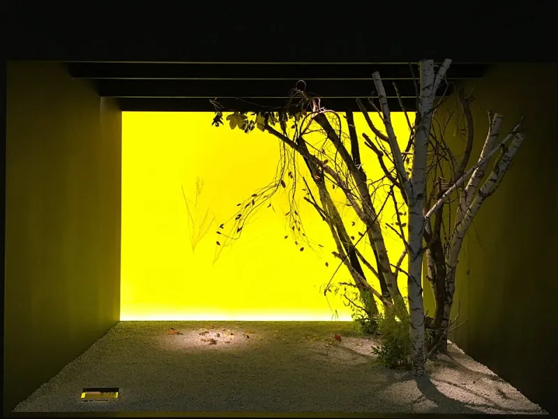
Photo: Gryffindor, CC0, via Wikimedia Commons
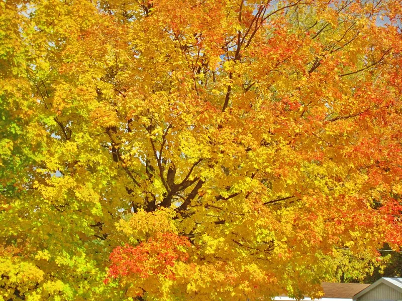
Open Pinterest on a Tuesday in late June. You'll find sunflower arrangements, sure. Maybe some Fourth of July tablescapes. But scroll for thirty seconds and the amber starts bleeding in — terracotta mugs, dried pampas grass, moody forest trails dusted in orange. Autumn doesn't wait for its season anymore. It just lives here now, ambient and omnipresent, like a screensaver that never fully closes.
That's not an accident.
The Algorithm Has a Favorite Season
Platforms like Pinterest and TikTok are engagement machines, and engagement has a texture. Warm tones — burnt orange, deep burgundy, dusty gold — consistently outperform cooler palettes in click-through and save rates. Pinterest's own trend reports have repeatedly flagged "cozy aesthetic" content as a perennial top performer, not just in Q4 but across the entire calendar year. TikTok's recommendation engine amplifies content that triggers emotional resonance quickly, and fall imagery — with its layered associations of nostalgia, transition, and comfort — does that faster than almost anything else.
Content strategist Maya Delacroix, who manages visual branding for several mid-size lifestyle brands, puts it bluntly: "If you post a beige linen couch with a chunky knit throw and a single dried leaf on the arm, it performs. It doesn't matter if it's March. The algorithm doesn't care about your calendar."
This creates a feedback loop that's hard to escape. Creators optimize for what works. What works keeps getting amplified. What gets amplified shapes what new creators think "good content" looks like. And so the aesthetic deepens its roots.
Nostalgia as a Visual Currency
There's a psychological layer underneath the algorithmic one, though. Autumn taps into something genuinely primal for a lot of Americans — the smell of school supplies, football Sundays, Halloween costumes, Thanksgiving kitchens. These are some of the most emotionally dense sensory memories most people carry, and visual cues can unlock them instantly.
Psychologists describe this as "autobiographical memory triggering" — the way a single image can collapse time and drop you back into a specific felt experience. Autumn imagery is unusually rich in these triggers. A red maple leaf on wet pavement. Steam rising from a paper coffee cup. The particular quality of afternoon light in October, golden and slightly exhausted.
When you're scrolling at midnight after a long day, that kind of image doesn't just look pretty. It feels like a small emotional rescue. Platforms have figured this out, and they've quietly built their recommendation logic around it.
The Creators Caught in the Crossfire
For photographers and digital artists trying to build a following, this creates a genuine tension. Lean into autumn aesthetics and the numbers move. Step away from them and you're fighting the current.
Landscape photographer Jordan Tse describes the frustration clearly: "I spent two weeks in the Cascades last spring shooting these incredible fog-and-fern compositions. Really moody, really green, super different from my usual work. The engagement was maybe a third of what I get when I post fall stuff. Same quality. Same effort. The season just didn't pop the same way."
That gap isn't just discouraging — it actively shapes creative decisions. Tse admits he's started planning shoots with an eye toward what will translate visually on a small screen, in a fast scroll. "You start thinking in thumbnails. And thumbnails love warm contrast."
Other creators have tried to push back more deliberately. Digital illustrator Priya Shankar spent several months creating what she called a "spring archive" — a series of pastel-forward, high-detail botanical illustrations intentionally designed to reclaim spring as a visual identity distinct from the fall aesthetic. The project got critical appreciation from other artists in her community. It did not go viral.
"I don't regret it," she says. "But I learned something about the gap between what the creative community values and what the algorithm rewards."
What It's Doing to Our Visual Culture
Zoom out far enough and this starts to look like something more significant than just a trend. When one season's aesthetic dominates visual culture year-round, it quietly narrows the creative vocabulary everyone is drawing from. Spring greens feel risky. Summer brights feel shallow. Winter's stark minimalism gets labeled "cold" in a way that's not quite a compliment.
Design educators have started noticing this in student work. Younger designers who've grown up with heavily algorithmic feeds often default to warm, autumnal palettes without questioning why — it's simply absorbed as the baseline of what "feels right." Breaking them out of that default requires actively reintroducing them to other seasonal languages as legitimate creative choices.
There's also a homogenization risk. When thousands of creators are all chasing the same aesthetic signals, the internet starts to look like a single very large mood board. Scroll long enough and the individual voices blur. The cozy cabin and the terracotta pot and the golden-hour bokeh all start to feel like they came from the same place, even when they didn't.
Finding Space Outside October's Gravity
None of this means autumn imagery is bad — obviously, it's beautiful, which is part of why it works. But the most interesting creative work happening right now is often being made by people who've consciously decided to stop letting the algorithm set their seasonal agenda.
Some photographers are doubling down on winter's graphic austerity, finding ways to make bare trees and flat gray skies feel intentional rather than bleak. Others are exploring the visual complexity of late spring — that specific window when everything is maximally green and slightly chaotic before summer flattens it out. A small but vocal community of designers has been working to rehabilitate summer's visual identity, stripping it of its kitschy associations and finding something more considered underneath.
What they share is a willingness to work against the current. To post the image that doesn't thumbnail as warm. To trust that a different kind of visual resonance is possible, even if the algorithm takes longer to catch up.
At Autumn Pixels, we've always believed that seasonal seeing is a practice — not a formula. The fall light is real and gorgeous and worth chasing. But so is every other light. The question is whether we're choosing our seasons or letting our feeds choose them for us.