Snow Blindness: How Digital Creatives Are Finally Seeing Winter Clearly

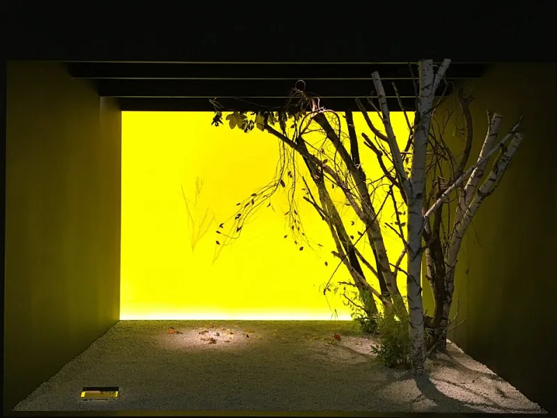
Photo: W.carter, CC BY-SA 4.0, via Wikimedia Commons
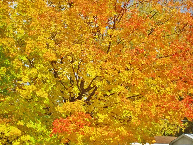
For years, the creative internet has had a color problem. Open any design mood board from October through February and you'll find the same warm amber tones, the same burnt sienna gradients, the same crunchy-leaf energy borrowed from autumn's seemingly endless visual vocabulary. Winter, the season that actually occupies most of that calendar stretch, barely gets a seat at the table.
That's starting to change.
A loose but growing community of digital artists, brand designers, and photographers across the US are making a deliberate pivot — away from the cozy, oversaturated warmth of fall aesthetics and toward something quieter, stranger, and arguably more technically demanding. They're building portfolios and brand identities rooted specifically in winter's visual language: the negative space, the near-monochromatic palettes, the way frost rewrites familiar surfaces into something almost alien.
And the results are genuinely striking.
The Problem With Playing It Warm
Let's be honest about why winter got skipped for so long. Autumn is easy. The colors are saturated, the contrast is naturally high, and there's a built-in emotional shorthand that audiences respond to almost automatically. Rust, ochre, and amber carry warmth — literally and psychologically. They feel safe to reach for, both as a creator and as a viewer.
Winter asks more of you.
"When you strip out the warmth, you have to actually think about what you're doing," says Maya Trellford, a Minneapolis-based brand designer who began building her portfolio around winter palettes about two years ago. "Autumn is forgiving. You can throw warm tones at something and it reads as intentional. Winter forces you to be precise. Every decision shows."
That precision is exactly what's drawing a new generation of creatives toward the cold season. For designers who've grown tired of watching their work blur into a sea of pumpkin-spice sameness, winter offers something autumn stopped providing a long time ago: genuine differentiation.
Crystalline Textures and the New Minimalism
One of the most technically interesting developments in winter-forward design is the growing use of crystalline and frost-based textures — not as decorative flourishes, but as structural elements.
Think about what ice actually looks like up close. It's not white. It's a shifting field of translucent blues, muted greens, and near-silver grays. The way light refracts through a frozen surface creates a complexity that's almost impossible to replicate with standard gradient tools, which is part of why digital artists are increasingly turning to macro photography and custom texture packs built from actual frost formations.
Jordan Seki, a digital artist based in Portland, Oregon, spent last winter photographing frozen puddles, car windshields, and window glass at dawn. What started as a personal project turned into a full texture library that now underpins most of his client work.
"People see these textures in the finished designs and they can't quite place them," he says. "They know they're looking at something real, something natural, but it doesn't register as 'ice' right away. It just reads as incredibly sophisticated texture. That ambiguity is the whole point."
The trend connects to a broader chromatic minimalism movement that's been building quietly in design communities — particularly among younger designers who grew up watching Scandinavian and Japanese aesthetic sensibilities filter into American visual culture. Winter, with its naturally compressed color range, is practically tailor-made for that kind of restrained precision.
Negative Space as the Main Character
If there's one visual principle that separates winter design from every other seasonal aesthetic, it's the use of negative space. Winter landscapes are defined by absence — bare branches against flat gray skies, a single figure crossing an empty parking lot, the way fresh snow smooths out every texture until a yard becomes a blank canvas.
For designers trained to fill every corner of a composition, learning to let that emptiness work is a genuine skill shift.
"I had to un-learn a lot of what I thought good design looked like," admits Trellford. "I kept wanting to add things. More elements, more texture, more contrast. Winter kept teaching me to subtract instead."
This philosophy is showing up in everything from editorial layouts to brand identity systems. Several independent studios on the East Coast have begun positioning their work explicitly around what some are calling "cold composition" — design systems built on wide margins, deliberate white space, and typography that floats rather than anchors.
The visual effect is immediately distinctive. In a scroll-heavy digital environment where most design screams for attention, work built on winter's quiet logic tends to stop thumbs in their tracks precisely because it doesn't.
The Photography Angle
For photographers, winter has always been a technical challenge — harsh, flat light, limited golden hour windows, and subjects that require real patience to find. But those constraints are increasingly being reframed as features rather than bugs.
The compressed dynamic range of overcast winter light, for instance, makes it ideal for a certain kind of moody, desaturated portrait work that's been gaining serious traction in editorial and commercial photography circles. The absence of color forces the eye toward form, texture, and expression in ways that the lush, saturated light of other seasons can actually work against.
"Winter light is honest," says Seki. "It doesn't flatter. It reveals. And there's a whole audience of clients and viewers who are hungry for that right now — for images that feel real instead of performed."
Building a Brand Around the Cold
Perhaps the most interesting development in all of this is the emergence of creatives who aren't just incorporating winter aesthetics into their work — they're building entire brand identities around them.
That's a bolder move than it might sound. Seasonal branding has historically been treated as a liability in creative work. The conventional wisdom says you want your portfolio to feel timeless, not tied to a specific time of year. Winter-forward designers are pushing back on that assumption, arguing that a strong, specific visual identity — even a seasonal one — is more valuable than the vague versatility most portfolios aim for.
"Being known for something is worth more than being known for nothing in particular," Trellford says flatly. "I'd rather be the winter designer than just another designer."
Given how much creative real estate autumn has occupied for the past decade, that's a pretty compelling piece of territory to stake out. Winter is vast, visually complex, and almost entirely unclaimed.
The quiet season, it turns out, had a lot to say. We just weren't listening.