The Sun's Geometry: What the Angle of Light Actually Does to Your Seasonal Colors
Here's a question most photography tutorials skip entirely: why does the same red barn look completely different in June than it does in December, even at noon on a clear day with identical weather conditions? The barn hasn't changed. The paint hasn't changed. Your camera settings might be identical. But the image looks like it was shot in a different country.
The answer is geometry. Specifically, the geometry of where the sun sits in the sky — and that number changes every single day of the year in ways that cascade through every color relationship in your frame.
Solar Altitude: The Number That Explains Everything
Solar altitude is the angle of the sun above the horizon, measured in degrees. At solar noon on the summer solstice in Atlanta, Georgia, that angle is roughly 79 degrees — almost directly overhead. At solar noon on the winter solstice in that same city, it drops to about 32 degrees. That's not a subtle difference. That's the sun moving from nearly vertical to less than halfway up the sky.
What does that angle change? Essentially everything.
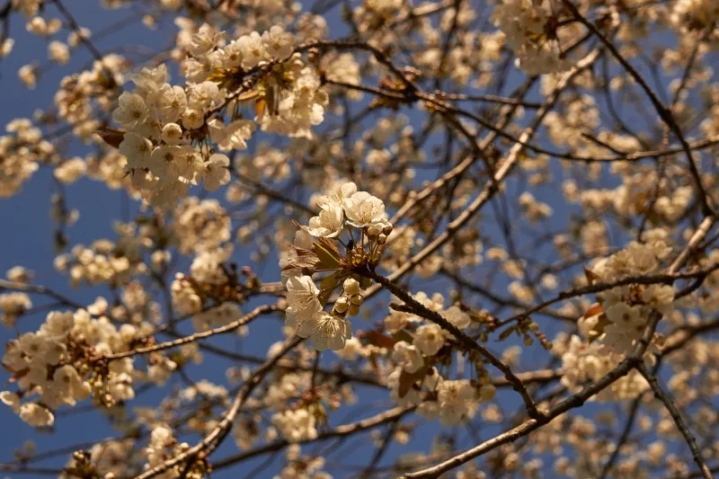
When the sun is high — summer, midday, high latitude in June — light is traveling through the minimum amount of atmosphere to reach you. It arrives relatively unfiltered, which means it skews toward the blue end of the spectrum. Shadows are short and fall almost directly beneath objects. The light feels hard and directional from above. Colors read as saturated and slightly cool.
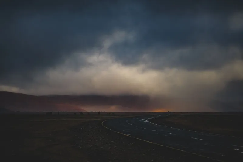
When the sun is low — winter, early morning, late afternoon in any season — light travels through a much longer atmospheric path to reach the same point on Earth. That extended path scatters the short blue wavelengths and lets the longer red and orange wavelengths through. The light warms up. Shadows grow long and reach horizontally across the scene. Everything develops a directional quality that changes the relationship between lit surfaces and shadow sides dramatically.
This is the actual mechanism behind seasonal color shifts. Not mood. Not cultural association. Physics.
Shadow Behavior by Season
For photographers and designers, the most immediately practical consequence of solar altitude is what it does to shadows — because shadows are where contrast lives, and contrast is what gives a scene its tonal depth.
In summer, high-angle shadows are dense and almost directly below their objects. A tree at noon in July casts a shadow that mostly disappears under the canopy. A person standing outdoors casts a shadow that's roughly as long as they are tall, maybe shorter. The scene has contrast, but it's largely vertical contrast — the difference between the lit top of a surface and the unlit underside.
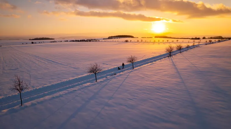
In winter, low-angle shadows stretch horizontally across the landscape. That same tree at noon in December casts a shadow three or four times its height. A person standing in open ground casts a shadow that extends twenty feet across the snow. This horizontal shadow behavior creates what photographers call "raking light" — a quality where every small surface irregularity catches its own shadow, revealing texture that high-angle summer light would completely flatten.
This is why winter landscapes look more three-dimensional in flat photography. The geometry is doing extra work.
What This Means for Color Relationships
Here's where it gets genuinely useful for design work: the angle of light doesn't just change the color of the light source — it changes the color relationships between elements in the same scene.
Consider a composition containing a warm orange element and a cool blue-gray element. In summer light, both colors are receiving similar spectral illumination. The contrast between them is primarily a hue contrast — orange versus blue. Straightforward.
In winter light, the warm orange element receives the reddish low-angle sunlight and gets amplified — it reads warmer than it actually is. The blue-gray element, sitting partially in the long horizontal shadows, gets cooled further. The contrast between those two elements becomes more extreme, not because the elements changed, but because the light geometry pushed them further apart on the temperature spectrum.
This is why seasonal color palettes can't just be swapped by adjusting a white balance slider. The relationships between colors in a scene are different by season, not just the overall cast.
Practical Applications for Photographers
Understanding solar altitude gives you a framework for planning shoots that goes well beyond the usual "golden hour" advice.
Map your location's seasonal altitude range. You can look up the solar altitude for any US city on any date using free tools like timeanddate.com or the NOAA solar calculator. Before a major shoot, check what altitude you'll be working with. A noon shoot in Minneapolis in November gives you about 25 degrees of altitude — closer to sunrise/sunset quality light than midday summer light. Plan accordingly.
Use shadow length as a compositional tool. In winter and early spring, the long horizontal shadows aren't a problem to work around — they're a design element. A row of trees casting parallel shadows across a snow-covered field in January creates a graphic quality that's impossible to replicate in July. Seek it out deliberately.
Rethink your white balance assumptions. If you're shooting in late October at 3 PM in the Pacific Northwest, the sun is already at a low altitude and the light is already warm. Adding more warmth in post might actually be overcooking the scene. Sometimes the most accurate seasonal color comes from trusting the geometry and leaving the temperature closer to neutral.
For Designers Working from References
If you're creating seasonal design work from reference images rather than original photography, the same geometric principles apply — but you need to read them in reverse. When you're selecting reference photos for a seasonal project, look at the shadows. Short, high-contrast shadows directly beneath objects suggest summer geometry. Long, raking horizontal shadows suggest winter or shoulder-season geometry. If your reference image's shadow behavior doesn't match the season you're designing for, the color palette you pull from it won't feel authentically seasonal, even if the colors themselves look right.
The sun's angle is a calendar. Learn to read it, and you'll see every season more clearly — and design it more honestly.
The Geometry Is Always There
Seasons aren't just temperature and foliage. They're a specific, measurable relationship between the Earth and the sun that changes the fundamental geometry of light hitting every surface you photograph or design. That geometry dictates shadow length, color temperature, contrast behavior, and the way different hues in a scene relate to each other.
Most seasonal design advice treats color as a surface-level quality — something you adjust with a preset or a palette swatch. But the designers and photographers who produce work that feels genuinely, convincingly seasonal are usually the ones who've internalized the geometry underneath the color. They know why November light does what it does. And that knowledge shows up in every frame.