Almost Autumn Is the Realest Thing You'll Ever Shoot
The Postcard Version Isn't Fooling Anyone
There's a very specific kind of fall that lives on stock photo sites and pumpkin spice marketing decks. You know the one. Every leaf is a saturated amber or a clean, confident crimson. The light hits at a perfect 45-degree angle. There's no mud. No half-green holdouts clinging to the upper branches. No weird brownish-gray days that can't decide what they want to be.
It's beautiful, technically. And it feels completely hollow.
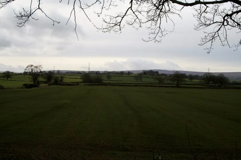
More and more photographers and designers are naming something they've quietly felt for years: the most visually compelling version of autumn isn't autumn at all. It's the few weeks that come before it fully commits. The liminal stretch when summer is clearly losing the argument but fall hasn't shown up to claim its seat. That awkward, unresolved, genuinely strange in-between — that's the stuff that hits different.
There's even a name for the opposite effect, borrowed from robotics and animation: the uncanny valley. It's that unsettling dip in believability when something looks almost human but not quite. The almost-ness is what makes it feel wrong. Weirdly, seasonal aesthetics seem to work in reverse. The almost-autumn — the not-quite, the unfinished — is what feels most real.
Why Peak Seasons Feel Like a Lie
Peak seasons are, by definition, the extreme version of a thing. Peak fall means maximum saturation, maximum contrast, maximum drama. And that's exactly the problem.
Our visual systems are calibrated for variation, not perfection. When everything in a scene is optimized — every hue pulling its full weight, every tree doing exactly what a fall tree is supposed to do — the brain reads it as constructed. Because it kind of is. We've seen that image so many times, in so many ads and Instagram grids and Hallmark movies, that it no longer functions as observation. It functions as reference.
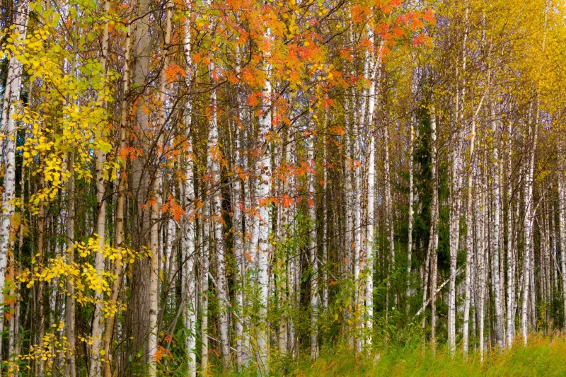
The pre-autumn moment, by contrast, hasn't been branded to death yet. A maple that's gone orange on one side and is still holding green on the other isn't photogenic in the traditional sense. It's confused. It's mid-process. It looks like something caught in the act rather than something posed for a portrait. And that rawness is what registers as authentic.
Photographers who work in documentary and street traditions have understood this for decades — the decisive moment isn't the finished thing, it's the thing in motion. Seasonal transition is just that principle applied to the calendar.
The Color Palette Nobody's Naming Yet
Ask a designer to describe a fall palette and you'll get the usual suspects: burnt orange, deep burgundy, warm ochre, maybe a muted gold. These are real, valid colors. They're also everywhere.
But the transitional palette — the one that exists in late August and early September across most of the US, or in that strange warm week in October right before the temperature finally drops — is way harder to pin down. It's dusty sage that hasn't committed to going yellow. It's a washed-out green that's more tired than vibrant. It's the particular khaki-brown of a lawn that's been dry too long. It's the color of things giving up gracefully.
Designers working in editorial, packaging, and brand identity are starting to reach for these colors not because they're trendy but because they communicate something that full-saturation fall simply can't: time passing. Impermanence. The feeling of standing in a moment that won't hold still.
There's a reason some of the most interesting seasonal design work right now looks slightly desaturated, slightly unresolved. It's not a mistake. It's a choice to represent the experience of living through a season rather than the idealized memory of one.
What Your Camera Sees That Your Eyes Edit Out
Here's something worth sitting with: your eyes are constantly editing your visual experience. Your brain fills in gaps, corrects for inconsistency, and nudges perception toward the expected version of things. When you're standing in a half-turned forest in mid-September, your brain is already nudging you toward fall because that's where the trajectory is pointing.
Your camera doesn't do that. It records what's actually in front of it — the weird, specific, unidealized version of the scene. That's why photographers often come back from a shoot in early fall with images that look more interesting than what they remember seeing. The camera caught the in-between. Their memory had already smoothed it into something more familiar.
This is worth building a practice around. Shooting in the transitional weeks — not waiting for peak color, not chasing the postcard moment — trains your eye to see what's actually happening instead of what you expect to see. The resulting images tend to be more personal, more specific, and more visually surprising than anything shot at the height of the season.
If you're in the Northeast, that window opens in late August. In the Pacific Northwest, it might come in October or even November. In the South, it's that brief stretch in November when the light changes before the leaves fully do. Wherever you are, that window exists, and it's shorter than peak season. Which is part of what makes it worth chasing.
The Authenticity Problem in Seasonal Design
There's a broader conversation happening in design circles right now about what authenticity actually means visually. For a long time, the answer was craft — handmade textures, analog grain, visible process. That aesthetic did real work for a while, and then it got commodified like everything else.
The new version of authenticity might be temporal. Not how something was made, but when — and specifically, whether it captures a moment that's still in flux rather than one that has already resolved into its final form.
Transitional seasons are perfect material for this because they're inherently unstable. They resist the kind of clean, finished quality that makes something look like a stock photo. They're harder to fake because the specific quality of a half-changed maple or a September afternoon that can't decide if it's warm or cool is deeply particular to a place and a moment. It can't be easily reproduced in post, and it doesn't translate well to a generic template.
For designers and photographers who are tired of work that looks like it could've been made anywhere, that specificity is the whole point.
Shoot the Before, Not the During
The practical takeaway here is simple, even if the psychology behind it is complicated: stop waiting for peak. The most interesting version of any season is the one that's still becoming itself.
Get out in the weeks before the calendar tells you it's time. Shoot the tree that's half-committed. Design with the palette that doesn't have a name yet. Sit with the colors that feel unresolved, because unresolved is another word for alive.
Almost-autumn isn't a consolation prize for missing the real thing. It might just be the real thing — the version that hasn't been flattened into a mood board yet, the one that still has some friction left in it.
And friction, it turns out, is exactly what makes something feel true.