Your Brain Is Lying About Spring: The Memory Glitch That's Wrecking Your Color Work
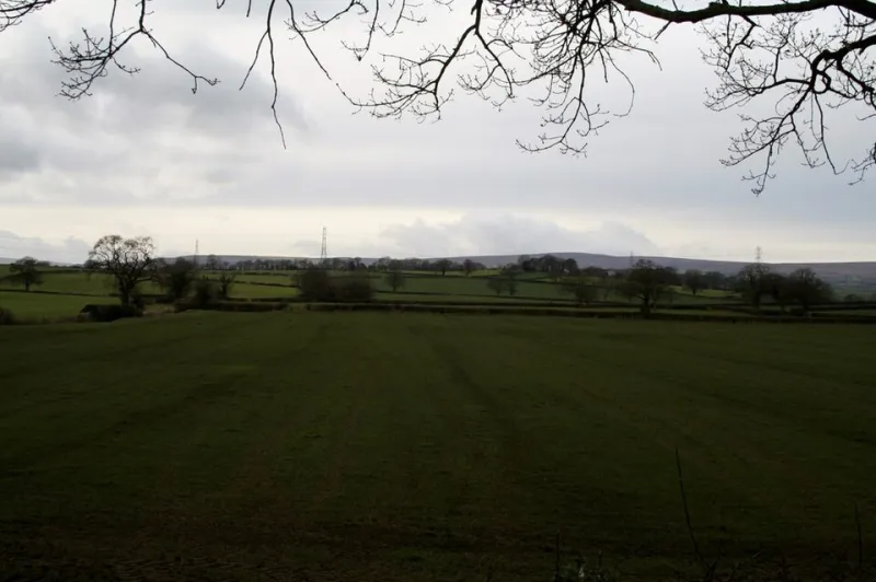
Photo: Geoff Evans , CC BY-SA 2.0, via Wikimedia Commons
You've been waiting for it all winter. That specific pink — the one you've been building mood boards around since January. Soft, warm, almost peachy. The color of every spring campaign you've ever loved. You finally get outside with your camera, and the RAW files come back looking... muddy. Grayish. Weirdly muted. You check your white balance three times. You wonder if your monitor is off.
It's not your monitor. It's your memory.
The Season You're Designing For Doesn't Exist
Here's the uncomfortable truth: most of us aren't designing for the season we're in. We're designing for the season we remember — and those two things are almost never the same.
Human memory doesn't store color the way a RAW file does. Neuroscientists call this phenomenon "categorical color perception" — our brains group colors into mental buckets labeled things like "spring pink" or "autumn orange," and those buckets get filled not with accurate data, but with emotionally amplified versions of what we've experienced. The warmth gets warmer. The saturation gets cranked. The gray, overcast Tuesday you shot in April? Your brain quietly edits that out.
Dr. Amy Winawer's research at NYU on color memory has shown that people consistently remember colors as being more saturated than they actually were. We don't just misremember colors — we misremember them in a very specific direction: toward the idealized version of whatever category they belong to. Spring gets pinker. Fall gets more amber. Winter gets crisper and more cinematic. Reality rarely cooperates.
What Photographers Keep Getting Wrong in the Field
Sarah Okonkwo, a Chicago-based editorial photographer who shoots a lot of seasonal lifestyle content, describes a moment of reckoning she had about two years ago. "I was doing a spring lookbook shoot in Lincoln Park, and I kept feeling like something was off. The whole scene looked wrong to me. Too cool, too flat. I kept adjusting."
When she finally pulled her untouched RAW files next to her edited versions, the difference was stark. "I had warmed everything up by like 800 Kelvin without even thinking about it. I was basically color-correcting reality to match my memory."
She's not alone. This kind of unconscious correction is incredibly common among photographers who've been shooting seasonal content for years. The longer you've been doing it, the more entrenched those mental color templates become — and the harder they are to override when you're standing in front of an actual scene.
The problem compounds when you factor in how much time most creatives spend consuming other people's seasonal imagery. If your visual diet is 90% curated Instagram content and Pinterest boards, your brain's reference for "what spring looks like" gets built around the most heavily processed, idealized versions of the season. Real spring — with its muddy lawns and overcast skies and that weird gray-green that shows up before anything fully blooms — doesn't stand a chance.
The Nostalgia Overlay
There's another layer to this that goes deeper than just color memory: emotional association. Spring, for a lot of people, carries a freight load of feeling. New beginnings. That specific childhood energy of the school year almost being over. First warm weekends. Those feelings don't just color your memory — they literally color how you see.
Psychologists refer to this as "affective priming" — when an emotional state influences perceptual processing. When you're out shooting in April and you're feeling that particular spring hopefulness, your visual system is actively biased toward seeing the scene the way you want it to look. The pinks look pinker. The greens look greener. You're not being dishonest. You're just human.
For designers who never even step outside to observe the real season — who work entirely from reference images and seasonal trend decks — the distortion is even more extreme. You're working from other people's emotional memories of a season, filtered through their own perceptual biases, compressed into a JPEG. That's a lot of signal loss between reality and your Figma file.
Training Your Eye to See What's Actually There
So how do you break the spell? A few approaches that actually work:
Shoot first, feel later. Before you do anything else on a location shoot, take five minutes to just shoot exactly what you see — no adjustments, no warming, no trying to make it look like what you expected. Treat it like a calibration shot. You'll often be surprised by how different your baseline reality is from your mental preview.
Use gray cards religiously. This sounds basic, but it's worth repeating: a physical gray card gives your editing software (and your brain) an honest reference point. It's much harder to unconsciously warm an entire scene when you've got a neutral anchor in your frame.
Keep a seasonal color journal. Not a mood board — an actual observational log. Go outside at different times of day during different weeks of the season and record what you actually see. Hex codes if you're a designer. Color temperature readings if you're a photographer. Build your own honest reference library instead of relying on your memory or someone else's curated feed.
Sit with the gray. Early spring in most of the US is genuinely, objectively gray. The Midwest in March is a study in taupe and khaki and washed-out straw. Instead of fighting it or "correcting" it, try leaning in. Some of the most interesting seasonal work happening right now is built around the honest, unglamorous in-between — the muddy pre-bloom, the leftover winter light. It's not as immediately satisfying as your brain's idealized spring palette, but it's real, and audiences can feel the difference.
Compare your edits to your RAW files after a cooling-off period. Come back to your edits two or three days after you've made them. The emotional charge from the shoot has faded a little, and you're more likely to catch yourself if you've been unconsciously pushing toward your memory of the season rather than the actual scene.
The Case for Seeing Badly
Here's the reframe, though: the gap between memory and reality isn't just a bug to fix. It's also one of the most interesting creative tensions you have access to.
Some of the most compelling seasonal photography sits right in that space — work that acknowledges both what a season looks like and what it feels like, without fully collapsing the two. The trick is knowing which one you're doing at any given moment. Are you making an honest observational image? Or are you making an emotional portrait of a memory? Both are valid. But confusing the two — thinking you're capturing reality when you're actually projecting nostalgia — that's where the work gets muddy.
Your camera doesn't feel the warmth of April on its sensor. It doesn't remember last spring, or the one before that. It just sees what's there. That's not a limitation. It's an invitation to look again.