Your Color Theory Has Never Seen a Dust Storm: Designing for the Seasons America Actually Has
Open almost any design resource about seasonal color theory and you'll find the same four chapters: the greens of spring, the saturated brights of summer, the warm ambers of fall, the cool whites of winter. Clean. Logical. Completely useless if you live in Phoenix, or coastal Louisiana, or the Willamette Valley in September.
The United States is not a single seasonal experience. It's a continental collision of climate zones, microclimates, and weather patterns that produce visual environments so distinct from each other they might as well belong to different planets. And yet most American designers are still working from a color framework built for somewhere that gets all four seasons on schedule — somewhere that looks, suspiciously, a lot like a New England postcard.
That's a problem worth examining.
The Haboob Palette Nobody Talks About
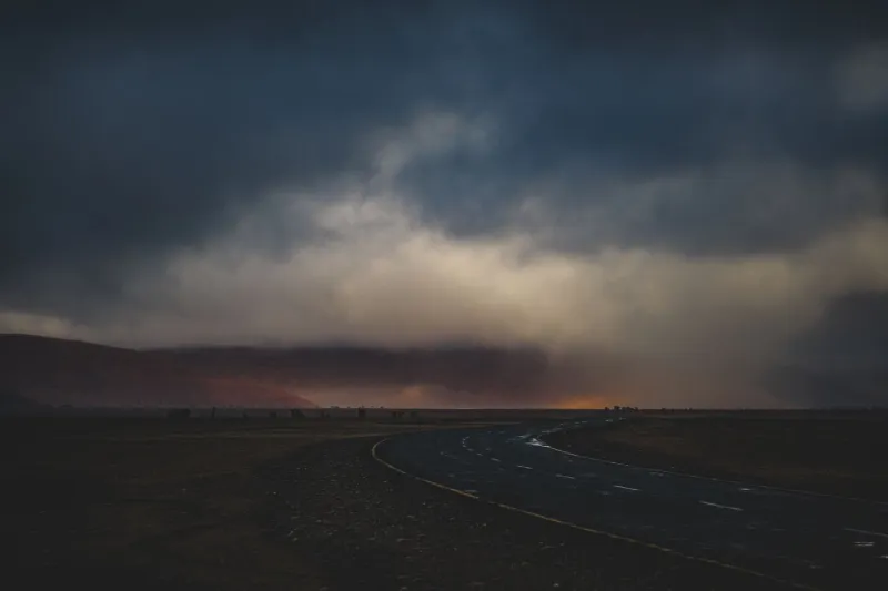
If you've never watched a haboob roll across the Sonoran Desert, you're missing one of the most visually arresting weather events on the continent. These massive dust storms — common in Arizona and New Mexico between June and September — transform the atmosphere into something that looks almost digital in its unreality. The sky goes from blue to a deep, roiling wall of ochre and raw sienna. The air turns the color of old parchment. Visibility drops, and everything left visible takes on a warm, diffused quality that no Instagram filter has ever quite captured.
The color palette of a haboob is extraordinary: deep burnt umber, dusty rose, muted gold, and a specific kind of washed-out sky blue that only appears at the edges of the storm. These aren't fall colors. They're not spring colors. They're desert monsoon season colors, and they're completely absent from mainstream design conversations about seasonal aesthetics.
For designers based in the Southwest, this is the visual language of summer. Not the bright, saturated, beach-umbrella summer of the Northeast — a heavy, amber-tinted summer that feels ancient and elemental and nothing like the stock photo version.
Wildfire Smoke and the Pacific Filter
Ask a photographer in Oregon or Northern California what late summer looks like, and they'll describe something that has become increasingly familiar over the past decade: a sky that's the color of a bruised peach, a sun reduced to a pale orange disk, and a quality of light so diffused that shadows nearly disappear.
Wildfire smoke creates one of the most distinctive ambient light conditions in American visual culture, and it's almost completely ignored in design discourse. When smoke fills the atmosphere, it scatters blue light and lets red and orange wavelengths pass through — which means everything you're looking at is being lit by a warm, apocalyptic filter that changes the apparent color of every surface it touches. Green grass looks khaki. Blue sky looks sulfurous yellow. White buildings look like they're made of old ivory.
For photographers working in these conditions, it's both a challenge and an opportunity. The light is unlike anything you can replicate in post-processing. It has a specific quality — simultaneously beautiful and unsettling — that captures something true about the Western summer experience in a way that a conventional golden-hour shot simply cannot.
For designers, it raises a genuine question: if this is the light your work is being created in, is it showing up in your output? Are you compensating for it unconsciously? Are you designing with it intentionally? Most designers in smoke-affected regions have never stopped to ask.
Gulf Coast Summer Is Its Own Universe
The monsoon season of the American Southwest gets occasional design attention, but the Gulf Coast's visual identity — particularly from June through October — is almost entirely overlooked in national design conversations.
Humidity changes everything. In coastal Texas, Louisiana, Mississippi, and Alabama, summer air carries so much moisture that the atmosphere itself becomes a visual element. Distant objects go soft and blue-gray. Colors desaturate in the midday heat. Late afternoon thunderstorms arrive with a specific quality of pre-storm light — that greenish-yellow tint that locals know means something serious is coming — that's one of the most distinctive visual signatures in American weather.
The Gulf Coast palette isn't the crisp, high-contrast visual language of a New England fall. It's humid, layered, slightly hazy, and saturated in ways that have nothing to do with conventional color theory. Greens are darker and more complex. Shadows are warmer. The sky does things in a Gulf Coast summer that don't exist anywhere else in the country.
Why This Matters Beyond Aesthetics
This isn't just an argument for regional representation in design, though that matters too. It's an argument about authenticity and creative accuracy.
When designers default to a universal seasonal framework that doesn't reflect their actual environment, they produce work that feels slightly abstract — competent but somehow placeless. Work that could have been made anywhere, by anyone, in any season. The four-season postcard framework isn't wrong, exactly. It's just not specific. And specificity is what makes visual work feel true.
The designers who are doing the most interesting seasonal work right now are often the ones who've stopped trying to translate their environment into the standard framework and started building frameworks from scratch. A designer in Tucson who builds a color system from the actual monsoon season she lives through every year is making something nobody else can make. That's not a limitation — that's an advantage.
Starting Where You Actually Are
The practical starting point is simpler than it sounds: document the weather events and light conditions that are specific to your region, and start treating them as legitimate seasonal categories.
If you live in a fire-prone region, smoke season is a season. If you live in the Gulf South, hurricane season has a visual language worth studying. If you're in the Great Plains, the particular quality of a spring tornado sky — that greenish, bruised quality that storm chasers photograph obsessively — is a legitimate color reference that no stock library has properly categorized.
Your region's weird, specific, sometimes alarming weather is part of your visual inheritance. It's been shaping the way you see color and light your entire life, whether you've acknowledged it or not. The question is whether you're going to keep pretending it doesn't exist, or start using it.