Rendered Seasons: The Video Games That Rewrote How a Generation Sees the Natural World
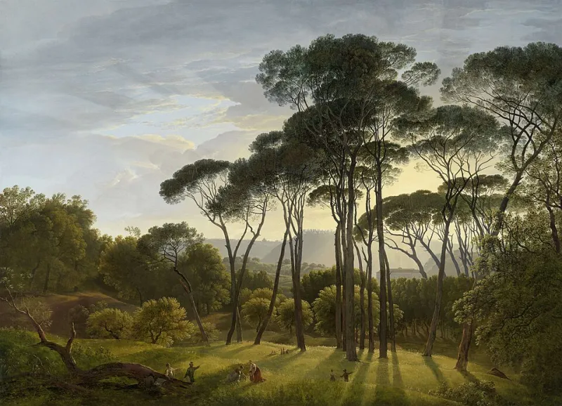
Photo: Hendrik Voogd, Public domain, via Wikimedia Commons
There's a shot in Firewatch — you've probably seen it referenced, maybe without realizing where it came from — where the Wyoming wilderness burns in that specific late-afternoon orange that feels less like sunlight and more like the memory of sunlight. The trees are stylized. The shadows are deliberate. The whole thing is, technically, a painting that moves. And yet for a significant number of working designers under 35, that image is as formative a visual reference as any photograph they've ever taken.
We need to talk about what that means.
Growing Up in the Rendered World
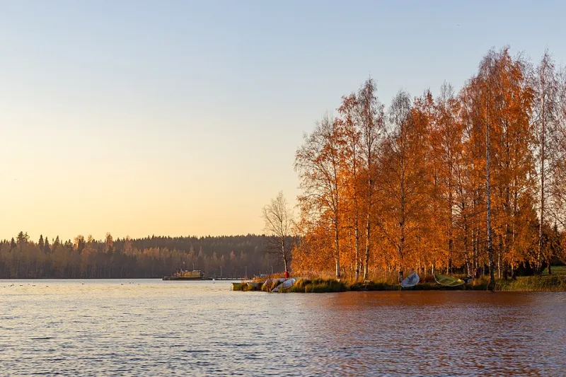
For older designers, seasonal visual language was built through direct experience — the specific quality of October light on a Midwestern afternoon, the way spring green in New England is almost aggressively saturated after a grey winter. Those experiences formed a visual baseline, a kind of internal reference library that design work could draw from.
For a generation that grew up with a controller in hand and a screen in front of them, the reference library looks different. The formative seasonal experiences weren't always outdoors. They were in games, in films with aggressive color grading, in the algorithmically curated visual feeds that served them thousands of images a day before they were old enough to have their own aesthetic opinions.
"I genuinely cannot tell you whether my idea of what autumn looks like comes from actual autumn or from Firewatch," admits one visual designer based in Seattle. "And I've thought about that a lot. I grew up in the Pacific Northwest — I had access to real fall. But the version that lives in my head when I'm making creative decisions? It's got that game's color palette all over it."
This isn't a confession of creative failure. It's a description of a genuinely new phenomenon: a generation of designers whose seasonal visual vocabulary was shaped as much by art directors and game developers as by the actual turning of leaves.
The Games That Built a Visual Language
It's worth being specific about which games, because the influence isn't evenly distributed.
Firewatch (2016) is the most cited reference point for autumn aesthetics in design communities — its warm, painterly Wyoming landscape became a kind of shorthand for a particular kind of melancholy beauty that translates directly into editorial and brand design work. The game's art director, Olly Moss, essentially created a visual grammar for digital autumn that has outlasted the game itself.
Spiritfarer (2020) did something similar for spring and summer — its hand-drawn, pastel-lit world gave those seasons an emotional texture that feels distinct from both photographic realism and traditional illustration. Designers who cite it as a reference are reaching for something that doesn't quite exist in nature: a spring that feels simultaneously gentle and grief-stricken, a summer that carries its own ending inside it.
And then there's Control (2019), which arguably did more for winter aesthetics in design than any nature photography in recent memory. Its brutalist, blue-grey interiors — cold, geometric, faintly threatening — gave designers a visual vocabulary for winter that moved far beyond the cozy or the picturesque.
"I was working on a winter campaign last year and the client kept rejecting our references as 'too stock photo,'" says a creative director at a small Chicago design studio. "I pulled a screenshot from Control as a mood reference almost as a joke. They immediately said 'yes, that's it.' We ended up building the whole campaign's color story around that palette."
Color Grading as Seasonal Shorthand
Film has always influenced design, but something specific happened in the streaming era: color grading became a dominant visual language in its own right, and audiences became fluent in it without necessarily realizing it.
The teal-and-orange grade that defined a decade of blockbusters. The desaturated, clinical cool of prestige TV dramas. The warm, hazy oversaturation of nostalgic coming-of-age films. These aren't just aesthetic choices — they're emotional instructions, and they've seeped deeply into how designers think about seasonal color.
When a designer describes wanting a "fall feel" in a project, they're often describing something that's closer to a film grade than to actual autumn light. The reference point has shifted from the world to the screen, and the screen's version is more controlled, more consistent, and — in a very specific way — more legible than the real thing.
"Nature is actually kind of noisy," observes a photographer and visual designer based in Austin who shoots both editorial work and game-inspired digital art. "Real autumn light is inconsistent. It changes every ten minutes, it depends on cloud cover, it doesn't always do what you want. The Firewatch version of autumn always does what you want. I think a lot of designers have quietly started preferring the controllable version."
When the Algorithm Becomes the Art Director
There's another layer here that's harder to trace but impossible to ignore: the role of algorithmic feeds in shaping seasonal visual expectations.
For digital natives, seasonal visual language doesn't arrive through direct experience — it arrives through curated feeds. Instagram, Pinterest, and TikTok serve up thousands of images of "autumn" or "spring" that have already been filtered, graded, and selected for maximum engagement. What gets surfaced isn't the average of actual seasonal experience. It's the most visually optimized version of it.
Over time, those optimized versions become the baseline. Real autumn starts to look slightly wrong — less saturated, less perfectly composed, less autumnal — compared to the feed's version. And the feed's version increasingly references games, films, and other screens rather than the outdoors.
It's a feedback loop that's genuinely reshaping what seasonal visual language means, and it's happening fast enough that the design industry is still catching up to its own transformation.
What This Changes for Visual Creatives
None of this is straightforwardly bad. Video game environments are extraordinary works of visual art — the design intelligence behind games like Firewatch or Spiritfarer is real and serious, and their influence on the broader design world isn't surprising. It makes sense that powerful visual work would propagate into adjacent fields.
But it does raise questions worth sitting with. If seasonal visual language is increasingly mediated — filtered through screens, algorithms, and game engines — what's the role of direct observation in a designer's practice? What does it mean to photograph autumn when your visual expectation of autumn was built by a game's art director rather than by actually standing in a forest?
Some photographers and designers are responding by deliberately doing the work of re-anchoring. Going outside with a camera and sitting with the messiness and inconsistency of real seasonal light. Resisting the impulse to grade toward the familiar warmth of a game palette. Trying to find what real spring or real winter actually looks like when you're not trying to make it look like something you've already seen.
It's harder than it sounds. The rendered world got there first, and it left marks.
But there's something worth recovering in the gap between the screen's version and the real thing — some quality of surprise, of imperfection, of genuine seasonal strangeness that no algorithm has quite managed to optimize away. Yet.