The Cold Palette Manifesto: Gen-Z Designers Are Ditching Autumn Warmth for Stark, Icy Minimalism

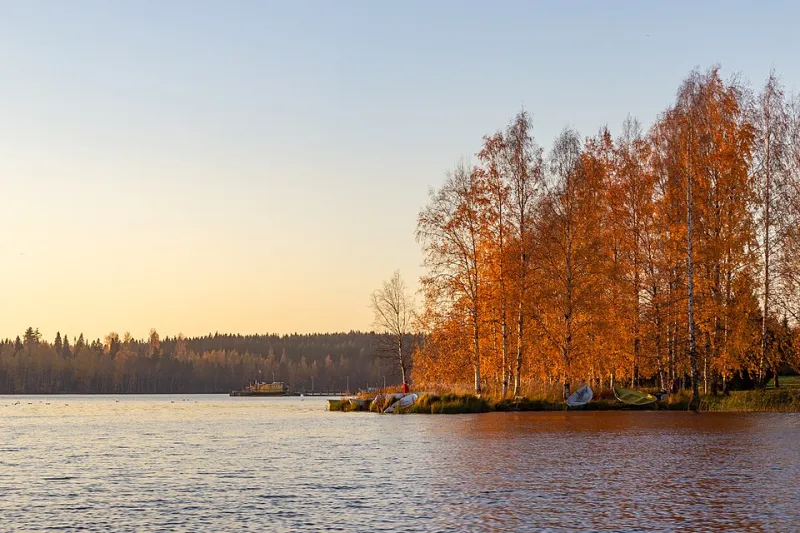
Photo: Dietmar Rabich, CC BY-SA 4.0, via Wikimedia Commons
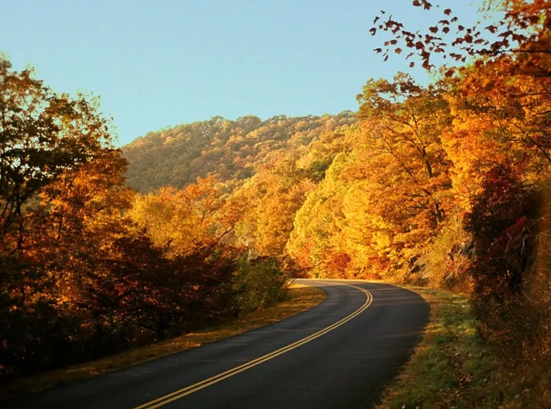
For years, the creative calendar has followed a familiar arc. Spring brings soft pastels. Summer goes bold and saturated. And then fall arrives with its reliable parade of burnt sienna, harvest gold, and that particular shade of terracotta that has appeared on approximately every lifestyle brand's Instagram grid since 2019. It's comfortable. It's proven. And a growing number of designers — many of them younger, many of them very deliberately over it — want absolutely nothing to do with it.
The counter-movement is real, it's gaining momentum, and it's cold in the best possible way.
What "Winter Minimalism" Actually Looks Like
Before we get into the why, it helps to get specific about the aesthetic itself. Winter minimalism, as it's showing up across portfolios, brand identities, and digital projects, isn't simply the absence of warm color. It's an active, considered choice — a palette built from frost whites, cool stone grays, icy blue-greens, and deep charcoal. Typography tends toward the spare and architectural. Negative space is treated as a design element in its own right, not a failure to fill the frame.
In photography, this sensibility translates to images that lean into flat winter light — the kind of diffused, directionless gray that most photographers historically tried to correct or avoid. Shadows are soft. Highlights don't bloom. The overall feeling is somewhere between a Scandinavian interior catalog and a high-end fashion editorial shot in January with no color grading.
It's not warm. That's entirely the point.
The Rebellion Has a Context
To understand why this aesthetic is resonating so specifically with Gen-Z designers, you have to understand what they grew up watching dominate the visual landscape. The millennial design era — warm neutrals, Instagram-optimized golden hour photography, the Kinfolk magazine aesthetic — was so pervasive and so thoroughly commodified that by the early 2020s, it had become visual wallpaper. Recognizable to the point of invisibility.
Gen-Z designers came of age watching that aesthetic peak, plateau, and get endlessly replicated by brands trying to feel approachable. The warmth started to feel less like genuine creative expression and more like a shortcut — a formula for appearing relatable without doing the harder work of actually saying something.
"Warm tones became the stock photo of design choices," says one 24-year-old brand designer based in Austin who asked to be identified only by her studio name, Voidform. "Everyone reaches for them because they feel safe. But safe stopped being interesting a long time ago."
Brands Making the Cold Shift
The trend isn't limited to individual portfolio choices. Several forward-leaning brands have made notable moves toward cool-toned minimalism in ways that directly challenge the warm seasonal default.
Consider the recent rebrand of a handful of direct-to-consumer wellness brands that, rather than leaning into the expected soft-warm palette of the category, have gone deliberately clinical — near-white packaging, cool gray typography, photography that looks like it was shot on a pale winter morning with no artificial light correction. The message is implicit but legible: we're not trying to comfort you with false warmth. We're trying to be precise.
Similar energy is showing up in digital product design. App interfaces that once defaulted to warm off-white backgrounds are increasingly adopting cooler, slightly blue-shifted neutrals. It reads as more modern, more focused — less like a cozy living room and more like a clear winter sky.
Even in the social media landscape, accounts built around cool-toned photography are consistently outperforming the warm-filter aesthetic in terms of engagement among younger audiences, according to several independent creative consultants who work with emerging brands.
Photography's Role in the Shift
It's worth spending a moment on what this means specifically for photography, because the cool-minimalist trend represents a genuine technical and aesthetic departure from how photographers have been trained to think about "good" light.
For decades, the golden hour — that warm, raking light just after sunrise or before sunset — has been treated as the holy grail of natural light photography. It's flattering, it's romantic, and it photographs beautifully in warm tones. The entire language of aspirational lifestyle photography has been built around it.
Winter minimalism requires photographers to find beauty in the opposite: the flat midday light of an overcast January afternoon, the cool blue cast of a shadowed snowfield, the graphic starkness of bare tree branches against a white sky. These images don't flatter in the traditional sense. They clarify. They strip away the warmth that can sometimes function as a kind of emotional padding — a way of making subjects feel more inviting than they perhaps actually are.
For photographers willing to embrace this, the results can be striking. There's an honesty to cool-light photography that warm-filtered images sometimes lack. What you see is closer to what's actually there.
Why This Challenges the Industry's Core Assumption
The deeper disruption here isn't aesthetic — it's philosophical. The creative industry has long operated on the assumption that seasonal color palettes are a natural, almost inevitable response to the world around us. Fall comes, and we reach for warm tones because that's what fall looks like. Spring arrives, and pastels follow. The seasons inspire the palette; the palette reflects the season.
The cool-toned minimalism movement breaks that chain entirely. It argues — implicitly, through the work itself — that the relationship between season and palette is a convention, not a law. That designers are free to respond to winter not with the expected frost-and-pine-green palette, but with something starker and more abstract. Or to respond to autumn not with amber and ochre, but with deliberate cool gray as a form of creative refusal.
This is, in a quiet way, a pretty radical position for a visual culture that has spent decades treating seasonal color as shorthand for authenticity.
The Limits of the Counter-Trend
It's worth being honest about the fact that aesthetic rebellion has a shelf life. The cool minimalism trend, if it follows the usual trajectory, will eventually become as ubiquitous as the warm tones it's pushing back against — and a new generation of designers will react against it in turn.
There's also a real risk of coldness tipping into inaccessibility. Design that prioritizes starkness over warmth can read as exclusionary — a visual "this isn't for everyone" that sometimes functions as intended and sometimes just alienates audiences unnecessarily.
But as a corrective force, as a reminder that no palette is mandatory and no seasonal expectation is binding, the cold palette movement is doing something genuinely useful for the broader creative culture. It's asking designers to make a real choice, not just reach for the comfortable default.
What Comes After the Warmth
The most interesting thing about winter minimalism isn't the palette itself — it's the permission structure it represents. When designers feel free to reject the expected seasonal color story entirely, they're asserting something important: that creative work doesn't have to reflect the world around it. Sometimes the most honest response to autumn is to paint it in ice blue.
At Autumn Pixels, we've always believed that the seasons offer a lens for seeing — not a script for what you're supposed to find. The cold palette movement is, in its own way, a very seasonal response to that idea. It's just looking at winter with clear eyes instead of warm ones.