The Season That Got Left Behind: Reclaiming Spring as a Visual Identity
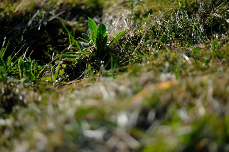
Photo: Psykon, CC0, via Wikimedia Commons
Here's a thought experiment: picture autumn. You probably got there in under a second — warm light, turning leaves, maybe a flannel texture or a foggy morning trail. Now picture spring. What came up? Probably something vague. Maybe cherry blossoms, if you live near a city that makes a fuss about them. Maybe tulips. Maybe just the color green, undifferentiated and slightly generic.
That gap in visual specificity is the whole problem.
Spring is, on paper, one of the most dramatic seasons in the American landscape. It's the moment when everything that looked dead comes back. It's volatile, unpredictable, often breathtakingly beautiful. And yet in contemporary design, photography, and digital art, it has become something close to a visual afterthought — a holding pattern between the stark clarity of winter and the saturated confidence of summer.
Something went wrong. Designers and photographers are starting to figure out what.
The Palette Problem
Ask most people to name spring colors and you'll get a pretty short list: pastel pink, pale yellow, mint green, lavender. These are the colors of Easter branding and baby shower invitations — pleasant, inoffensive, and almost completely drained of tension.
But spend actual time outside in April and May, and spring's real palette is far stranger and more interesting. There's the particular yellow-green of new leaves, almost acidic, before chlorophyll deepens. The muddy, complicated browns of thawed ground. The bruised purple of a sky about to storm. The hot, almost aggressive pink of a redbud tree against bare gray branches.
Photographer and visual artist Lena Okafor has spent the last two years specifically documenting what she calls "the real spring" — the season before it gets cleaned up and Instagrammed. "Everyone wants the cherry blossom moment," she says. "That's a real thing, and it's beautiful. But I'm more interested in the week before that, when everything looks kind of chaotic and muddy and half-finished. That's where the actual drama is."
Okafor's work leans into high contrast — dark, wet bark against the first pale blooms. Frost on new growth. The tension between something ending and something beginning, visible in a single frame. It doesn't look like a greeting card. It looks like something true.
Why Fall Won and Spring Didn't
The dominance of autumn aesthetics in visual culture isn't arbitrary — fall has a built-in compositional advantage. The color contrast is extreme and immediate. Warm tones against dark trunks, saturated reds against blue sky, golden light at angles that make everything look considered. It's a season that almost photographs itself.
Spring is harder. The light is often flat and overcast. The colors are subtle and require more careful handling. The visual story is about emergence and potential rather than peak saturation — and potential is harder to capture in a single frame than a red maple at full turn.
"Fall gives you the climax," says graphic designer and art director Marcus Webb, who's been developing what he calls a spring-forward design system for the past year. "Spring gives you the rising action. And in a culture that's optimized for instant impact, the rising action doesn't always register."
Webb argues that this is partly a compositional literacy problem. Designers and photographers have developed sophisticated visual languages for autumn over decades of practice and iteration. Spring hasn't had the same investment. The result is that even talented artists often default to cliché when they try to work with the season — reaching for the obvious cherry blossom or the safe pastel gradient because the more interesting visual moves haven't been mapped out yet.
Forgotten Approaches Worth Revisiting
There are threads worth pulling. Mid-century American painters — particularly the regionalists working in the Midwest and New England — had a much more nuanced relationship with spring's visual complexity. Artists like Andrew Wyeth understood the season's austerity: the way early spring can look almost austere, with bare fields and gray skies and just the faintest suggestion of green on the horizon.
That austerity is actually a design asset, if you're willing to work with it. It creates space. It has a quietness that autumn's intensity doesn't. For designers working in categories like wellness, editorial, or architecture, spring's understatement can be more sophisticated than fall's warmth.
Japanese design traditions offer another angle. The concept of mono no aware — often translated as the bittersweet awareness of impermanence — has long been associated with spring's brief, fragile blooms. American designers have largely borrowed autumn's version of this idea (the leaf that falls) while ignoring spring's (the flower that lasts one week). Both are valid visual meditations on the same thing.
Photographer Tomás Reyes has been experimenting with long-exposure work specifically during the transitional weeks of early spring — the period when snow and new growth coexist. "There's this moment in late March where you have snowdrops coming up through the last of the snow," he says. "It's one of the most visually striking things I've ever shot. But it's also almost impossible to find on stock photo sites, because nobody was out there to capture it. The season moves fast and people aren't paying attention."
Making Spring Stick
Part of what spring needs is simply more deliberate attention from serious visual artists — more people willing to do the work of developing a richer visual vocabulary for the season rather than defaulting to the pastel shorthand.
That means getting specific. Not just "spring" but the particular quality of a midwestern April morning. The difference between the green of a Pacific Northwest forest in March and the green of a Tennessee hillside in May. The way spring rain changes color relationships in ways that have nothing to do with the warm-tone expectations we bring from autumn.
It also means being willing to let spring be difficult. Some of its most interesting visual moments are uncomfortable — the mud, the gray skies, the half-dead and half-alive overlap that defines the season's first weeks. Leaning away from that difficulty in favor of the clean cherry blossom shot is understandable, but it's also what keeps spring shallow.
Webb puts it simply: "We've spent years learning to see autumn. We haven't done that work for spring yet. It's not that the season isn't there — it's that we haven't been paying attention."
At Autumn Pixels, the name is a commitment to a specific kind of light. But the practice of seeing — really seeing — doesn't stop when the leaves come back. Spring is waiting for someone to look at it properly. The frame is open.