The Quiet Luxury Problem: How Muted Palettes Are Flattening the Visual Year
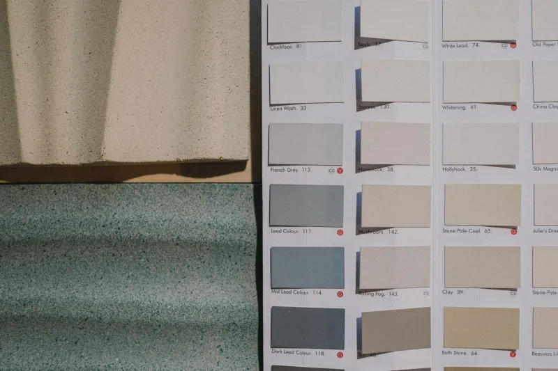
Let's be honest about what's happening on design platforms right now. Open any curated portfolio, any brand identity showcase, any editorial photography feed, and you will find the same tonal universe staring back at you: dusty rose, warm greige, muted sage, washed linen, ash. Beautiful, certainly. Sophisticated, arguably. Seasonally specific? Absolutely not.
This is the quiet luxury problem, and it's doing real damage to the visual calendar.
How We Got Here
The desaturation trend didn't appear out of nowhere. It tracked the rise of a particular aesthetic in luxury branding — think the stripped-back minimalism of Bottega Veneta, the cool restraint of Aesop, the deliberately undercooked color world of high-end real estate photography. When those visual languages filtered down through design platforms, Pinterest boards, and Instagram feeds, they got absorbed into the default vocabulary of "good taste."
For a while, that felt like progress. After years of maximalist everything, the restraint read as maturity. Muted tones suggested confidence — the idea that you didn't need to shout to be noticed.
But somewhere between trend and template, something got lost. The nuance got stripped out. And what we're left with is a design landscape where every season looks like a slightly different variation of the same cool, desaturated, vaguely melancholy afternoon.
The Seasonal Flattening Effect
Here's the thing about genuine seasonal color: it's not subtle. A real August afternoon in Georgia is aggressive — saturated, humid, almost violently green. A late March day in the Pacific Northwest has a particular quality of gray-green light that's nothing like December gray. Early November in New England is a specific kind of gold that doesn't exist in any other month.
These colors are loud. They're specific. They're not greige.
When designers default to desaturated palettes year-round — not because the project calls for it, but because that's what the current aesthetic consensus rewards — they lose the ability to encode actual seasonal information into their work. Everything becomes a soft blur of tasteful neutrals that could theoretically represent any month of the year.
For photographers, the same problem shows up in post-processing. The heavy-handed application of matte finishes, crushed blacks, and desaturated highlights has become so normalized that genuinely saturated seasonal light now reads as unsophisticated or "unedited" to audiences trained on the muted look. We've essentially punished reality for being too colorful.
The Trend Trap in Plain Sight
What makes this particularly tricky is that the muted palette trend is self-reinforcing. Algorithms reward content that looks like content that already performed well. Design platforms showcase work that fits the current aesthetic consensus. Clients have absorbed the same visual diet and now associate desaturation with quality.
So designers making rational, career-minded choices end up defaulting to the trending palette not because it serves their specific project, but because it signals competence in the current moment. That's understandable. It's also, over time, creatively deadening.
The irony is sharp: a trend that started as a rejection of visual noise has itself become noise — just quieter noise. When every brand, every portfolio, every editorial spread exists in the same tonal register, the restraint stops reading as intentional and starts reading as uniform.
What Genuine Seasonal Design Actually Asks of You
Visual storytelling tied to specific seasons requires a willingness to be specific — which means being willing to be wrong for the current trend cycle. A design that truly captures the quality of July heat in Phoenix or the particular blue of a Minnesota winter morning is going to have colors in it that don't match the mood board du jour.
That specificity is a feature, not a liability. It's what makes seasonal work feel true rather than decorative. But it demands that designers make an active choice to prioritize the subject over the aesthetic consensus.
This doesn't mean abandoning restraint or sophistication. A muted palette can be exactly right for a specific project, a specific season, a specific emotional register. The problem isn't desaturation itself — it's reflexive desaturation. It's reaching for the same tonal toolkit regardless of what the work actually needs.
The Case for Getting Loud Again
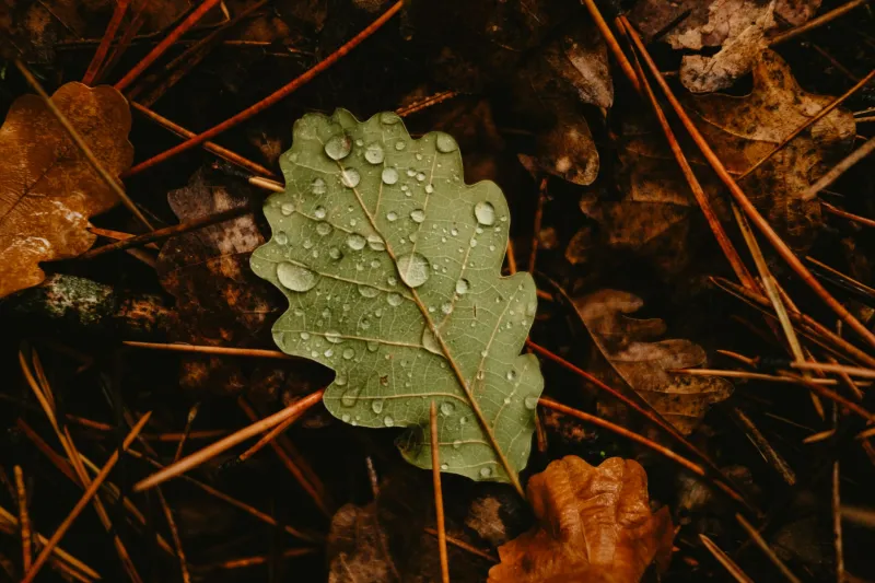
Some designers are already pushing back. There's a growing counter-current in illustration and editorial design that's deliberately reclaiming saturation — not as maximalism for its own sake, but as a form of seasonal honesty. Work that commits to the full-volume green of spring, the unashamed orange of October, the hard white of a February overcast.
It takes a certain confidence to publish work that looks that saturated in a feed full of muted tones. It can feel almost aggressive. But that's the point — real seasons are a little aggressive. They don't wait for your aesthetic preferences to catch up.
The visual year is one of the richest creative resources available to designers and photographers. Flattening it into a single tonal key in the name of trend alignment is a waste of something genuinely irreplaceable.
Desaturate when it serves the work. But know the difference between a creative choice and a habit you inherited from a luxury brand's Instagram account.
At Autumn Pixels, we believe every season deserves its full visual voice — even the loud ones.