Borrowed Feelings: How Creatives Fall in Love With Colors They've Never Actually Lived
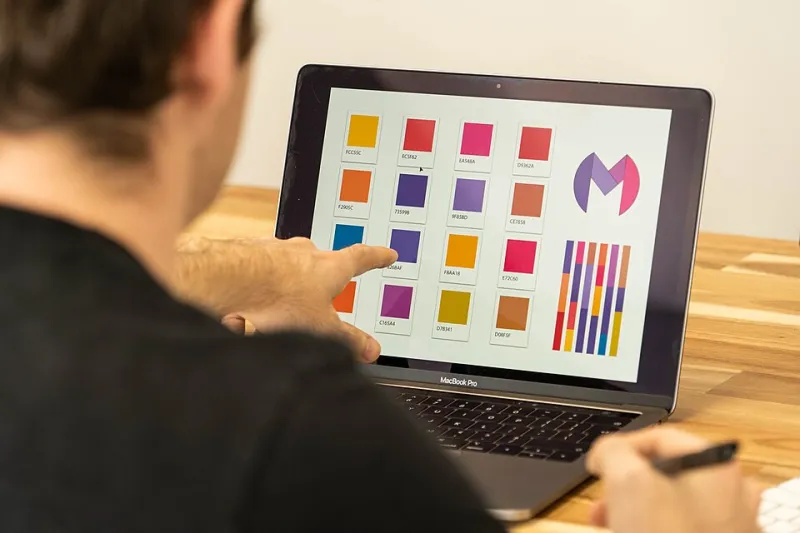
Photo: Claireneon, CC BY-SA 4.0, via Wikimedia Commons
The Color That Feels Like Home (Even If You've Never Been There)
Ask a designer in Phoenix what color makes them feel something — really feel something — and there's a decent chance they won't say terracotta or sun-bleached sand. They might say slate blue. Or the specific muted silver of a frozen lake surface at noon. Colors that describe a world they've maybe visited once, or seen only in photographs, or absorbed through a thousand hours of scrolling through Scandinavian lifestyle content.
This is the synesthesia effect in reverse. Not sounds triggering colors, but images of places you've never lived triggering emotions that feel uncomfortably personal. Designers, photographers, and digital artists are increasingly aware of this phenomenon — and some of the most interesting creative work being made right now is built directly on top of it.
The Gap Between Where You Are and What You Feel
Color psychology has always been a bit of a mess. The old rules — blue is calm, red is urgent, green is growth — were never as universal as marketing textbooks wanted them to be. Cultural context scrambles everything. But something more specific is happening in creative communities right now, and it goes deeper than cultural variance.
Creatives are developing intensely personal color vocabularies that have almost nothing to do with their actual physical environments. An illustrator who grew up in Southern California describes a specific desaturated amber as "grief-adjacent." A graphic designer from Atlanta says cool lavender grays feel like anticipation to him — not calm, not sadness, but the specific tension before something changes. Neither of these associations map to anything those colors "should" mean by conventional standards. And neither maps to the world those designers actually live in.
What's happening here is a kind of emotional borrowing. We absorb visual languages from media, from curated feeds, from films set in places we've never visited. And those absorbed images don't just stay on the surface. They sink in and start generating real feeling — the kind of feeling that later shows up in your work whether you planned it or not.
Algorithmic Seasons and the Images That Raised Us
There's a generational dimension to this that's hard to ignore. Designers who came of age in the era of Pinterest boards and Instagram aesthetics were essentially raised on visual content that had been filtered, curated, and algorithmically amplified before it ever reached them. The "golden hour" they internalized might have been photographed in Iceland. The cozy winter scene that feels like home might have been shot in Vermont by someone who's never actually spent a winter there either.
The algorithm doesn't care about your zip code. It cares about engagement. And the imagery that generates the most emotional response — the soft-focus autumn walks, the frost-on-glass close-ups, the low-contrast winter mornings — gets surfaced constantly, regardless of whether it reflects anyone's actual lived experience. We've all been marinating in a kind of visual fiction for years. It's not surprising that fiction has started to feel like memory.
Photographers talk about this too. Shoot in a consistently sunny climate long enough and you start craving overcast light — not because it's more technically interesting (though it often is), but because it feels like something specific. Something you've absorbed from a thousand images of somewhere else. The want is real even when the experience behind it is secondhand.
False Memories as Creative Raw Material
Here's where it gets genuinely useful: the most interesting designers working right now aren't fighting these borrowed associations. They're mining them.
There's a growing conversation in design communities about what some people are calling "emotional anachronism" — building visual work around feelings that don't correspond to any actual moment in the creator's life. The color story isn't autobiographical. It's constructed from absorbed imagery, half-remembered films, aesthetic rabbit holes explored at 2 a.m. And somehow that constructed emotional landscape can feel more resonant to an audience than something grounded in literal personal experience.
Why? Because the audience has the same borrowed feelings. They've absorbed the same visual diet. When a designer in Houston builds a winter campaign using colors that evoke something like quiet isolation and early darkness, viewers in equally sunny places feel it — because they've been trained by the same imagery. The "false memory" is collective. It's shared cultural property at this point.
This is what makes these color associations so powerful and so strange. They're not really false. They're just sourced from a different kind of experience — mediated, aggregated, emotionally real even when experientially hollow.
The Designers Who Are Doing This Intentionally
Some creatives are getting very deliberate about this process. Rather than letting absorbed color associations surface unconsciously in their work, they're mapping them out. Building personal color lexicons that document not just which hues they're drawn to, but why — tracing the emotional charge back to its source, whether that's a specific film, a mood board era, a piece of music that somehow suggested a visual tone.
This kind of reflective practice does a few things at once. It helps creators understand when they're being authentic versus when they're just echoing something they've passively absorbed. It also reveals which borrowed associations are genuinely useful — emotionally accurate even if experientially fictional — versus which ones are just aesthetic habits with no real charge behind them.
A photographer based in the Pacific Northwest described her process recently as "excavating the imagery that made me." She grew up in a region famous for gray skies and diffused light, but found herself obsessing over high-contrast golden-hour desert photography throughout her twenties. Only when she started tracing that obsession did she realize it was rooted in a specific road trip film she'd watched repeatedly as a teenager — not in any actual desire to live differently. The color palette she'd been chasing for years was a feeling about freedom borrowed from a fictional road, not a real one.
Once she understood that, she could use it better.
What This Means for Your Own Work
If you're a designer or photographer and some of this feels uncomfortably familiar, that's probably a good sign. The creatives who are doing the most interesting work right now aren't the ones with the most "authentic" relationship to their environments. They're the ones who are honest about how mediated their visual instincts really are — and who've found ways to work with that mediation rather than pretending it doesn't exist.
Your color associations are yours, even if they're borrowed. The feeling they generate is real, even if the experience behind them is secondhand. That amber that makes you feel something unnamed? It belongs to you now. The question is just whether you're using it intentionally or letting it use you.
The most interesting seasonal work being made right now lives in exactly this space — between the world as it is and the world as we've collectively imagined it. Between the climate outside the window and the one that somehow got inside your head. That gap isn't a problem to solve. It's the whole territory.