Why Your Winter Designs Feel Lifeless (And How to Stop Blaming the Season)
The Hangover Nobody Talks About
Somewhere around mid-December, it happens. You open a winter project — maybe a brand refresh, a photo series, a mood board for a client — and something feels off. The colors look anemic. The whole thing reads as unfinished, like someone forgot to turn the warmth up. You nudge the saturation slider. You pull the highlights. You add a color grade that pushes things toward gold, just slightly, just to make it feel alive.
And just like that, your winter project quietly becomes an autumn project.
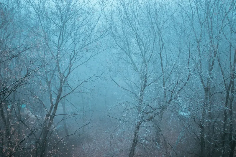
This is the saturation trap, and it catches more designers than anyone wants to admit. After months of working in fall's naturally rich visual language — the deep ochres, the burnt siennas, the moody crimsons — our eyes recalibrate to expect that level of chromatic intensity. Winter's palette, with its soft grays, icy blues, and near-neutral whites, registers as wrong rather than simply different. We don't see restraint. We see failure.
Why Autumn Conditions Your Eye
Fall is visually loud. That's not a criticism — it's just the reality of what the season offers. The light drops lower on the horizon, turning everything golden during those long, drawn-out magic hours. Leaves shift from green to yellow to orange to red in a matter of weeks, giving us a constantly evolving palette that's genuinely hard to photograph or design badly. The whole season is doing the heavy lifting for you.
Work in that environment long enough — whether you're shooting outdoors, pulling references from your camera roll, or just absorbing the world through your studio window — and your baseline shifts. What felt like a rich, saturated image in September starts to feel ordinary by November. You've adjusted. Your eye has been trained, quietly and without your permission, to see high saturation as neutral.
This isn't unique to photography or design. It's a basic function of how human perception works. We adapt to our environment, and then we judge everything against that adapted baseline. The problem is that creative tools don't reset with the seasons. Your monitor, your presets, your go-to Lightroom profile — they all carry the fingerprints of the last three months of work.
Your Monitor Is Part of the Problem
Here's something that doesn't get discussed enough: monitor calibration is a seasonal issue.
Most designers calibrate their screens once, maybe twice a year, and then forget about it. But the ambient light in your workspace changes dramatically between October and January. Warmer interior lighting in fall and winter affects how you perceive color on screen — specifically, it can make cooler, more neutral palettes look even more washed out than they actually are.
If you're working on winter imagery under warm tungsten or amber-toned LED lighting, your eye is compensating for that warmth by seeing your screen's cool tones as even colder and flatter. The image isn't broken. Your viewing environment is skewing your read on it.
A quick fix: use a color calibration tool like a Datacolor Spyder or X-Rite ColorMunk before starting any major seasonal project. And take a hard look at your room lighting. Daylight-balanced bulbs (around 5000–6500K) give you a much more neutral baseline for evaluating any palette, warm or cool.
Relearning How to See Muted Color
The real skill winter demands isn't technical — it's perceptual. You have to actively teach yourself to find value in restraint.
Muted palettes aren't flat palettes. There's a significant difference between a color that's been desaturated into lifelessness and a color that's been carefully held at low saturation to create atmosphere, tension, or quiet elegance. Scandinavian design has built entire visual movements on this distinction. So has Japanese wabi-sabi aesthetics, and increasingly, so has a lot of American minimalist branding.
One practical way to retrain your eye: spend a week studying winter photography from photographers who clearly love the season. Not photographers who shoot winter because they have to, but ones who seek it out — people shooting frozen lakes in Minnesota, overcast coastlines in Maine, snow-covered streets in Chicago before the plows come through. Look at how they use near-whites, how they let shadow areas go deeply cool without reaching for warmth, how negative space becomes a compositional tool rather than a problem to fill.
Then go back to your own winter work and ask a different question. Instead of why does this feel flat, ask what is this palette actually doing? Sometimes the answer is: not much. But sometimes you'll find that the restraint you were about to correct is actually the whole point.
The Preset Problem
If you shoot or edit with presets — and most working photographers and designers do, at least as a starting point — you're probably carrying autumn's DNA into every project without realizing it.
Presets built during or inspired by fall work tend to add warmth, lift shadows toward amber, and boost saturation in the orange and red channels. Applied to winter imagery, they don't just warm the photo — they fight it. You end up with a muddy, confused image that's neither the clean coolness of winter nor the rich warmth of fall. It's the visual equivalent of wearing a parka with flip-flops.
Build a separate preset library for your winter work, or at minimum, create neutral starting points with no warm bias. Start from zero and let the image's natural color story lead. This sounds obvious, but it's genuinely easy to forget when your muscle memory is already reaching for the same three presets you used all October.
Giving Winter Its Own Design Language
The deeper issue is that we've collectively decided autumn is the emotionally resonant season and winter is just what comes after. That bias shows up everywhere — in stock photo libraries, in brand mood boards, in social media aesthetics. Warm equals feeling. Cool equals cold, literally and emotionally.
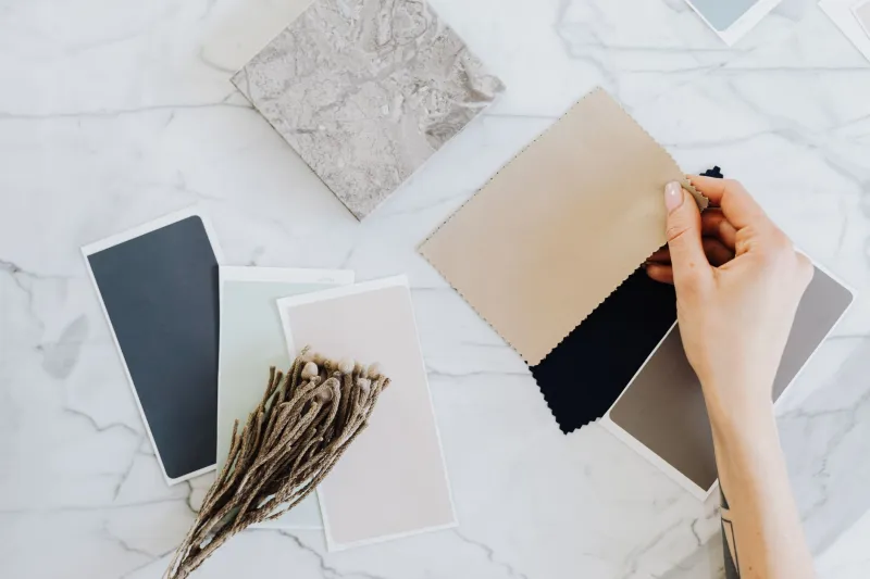
But winter has its own emotional register that's genuinely powerful if you let it work. Stillness. Clarity. The specific kind of quiet that comes after the noise. A palette of dove gray, slate blue, and barely-there lavender can communicate something that no amber-soaked image ever could — a kind of stripped-back honesty that feels almost brave in a visual culture addicted to warmth and richness.
The designers and photographers who figure this out don't fight winter's palette. They build a design language around it, one that treats low saturation as a choice rather than a compromise.
Your fall drafts aren't better because they're more saturated. They're just more familiar. Once you stop reaching for the slider and start listening to what winter is actually offering, the work tends to find its own kind of life — quieter, maybe, but no less real.