Hearing Autumn: How the Music in Your Headphones Is Quietly Dictating Your Color Palette
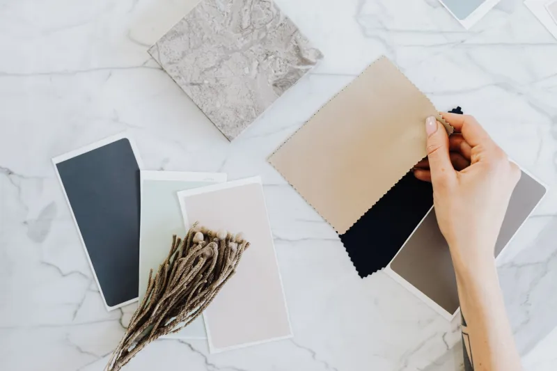
Somewhere between your third cup of coffee and the moment you finally commit to a color swatch, something sneaky is happening. The acoustic guitar track you put on to "help you focus" is not just background noise. It's actively negotiating with your visual cortex, nudging your hand toward burnt sienna, pushing you away from electric teal, whispering that yes, this warm ochre is absolutely the right call.
This is the synesthesia trap — and most designers have no idea they're already inside it.
The Invisible Soundtrack Problem
Synesthesia, in its clinical form, is a neurological condition where stimulation of one sense automatically triggers another. Some people see colors when they hear notes. Others taste shapes. It's rare, involuntary, and genuinely fascinating. But there's a softer, more common version playing out in creative studios across the country every single day — a learned, culturally reinforced version where we've been so thoroughly conditioned to pair certain sounds with certain visuals that the association feels hardwired.
Ask a room full of designers what fall sounds like and you'll get remarkably consistent answers. Acoustic guitar. Lo-fi hip-hop with crackle. Indie folk. The opening bars of something Sufjan Stevens adjacent. Maybe rain on a window. Maybe the muffled thud of boots on wet leaves.
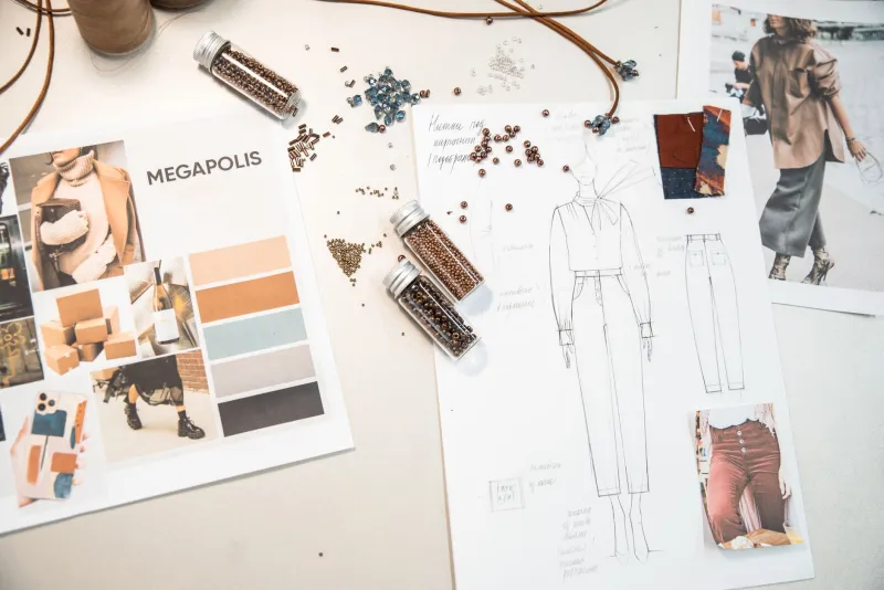
Now ask them what their fall design work looks like. Rust. Amber. Deep burgundy. Muted sage. Warm cream.
Coincidence? Not even close.
How the Loop Gets Built
This isn't about individual taste — it's about cultural repetition. For years, autumn has been packaged and sold with a very specific sensory bundle. Retail ads in October lean on acoustic warmth. Streaming platforms auto-generate "cozy fall" playlists that skew heavily toward mellow, organic instrumentation. The visual and audio cues reinforce each other constantly, and our brains — efficient little pattern machines that they are — lock the pairing in.
By the time you're a working designer, you've absorbed thousands of hours of this conditioning. You've watched enough fall-themed content, scrolled enough harvest-toned Instagram grids paired with lo-fi playlists, and sat through enough Thanksgiving commercials with their strings-and-woodwinds scores that the association is basically structural. You hear warmth. You see warmth. You design warmth.
The problem isn't that the pairing is ugly. It's that it's automatic. And automatic means you're not actually making a creative decision — you're executing a reflex.
The Mismatch Experiment
Here's a thought experiment that's worth turning into an actual exercise. Pull up your current fall project — the one with the warm palette and the cozy vibes — and swap the soundtrack completely. Put on something industrial. Try minimal techno or harsh noise or a film score built around dissonance. Or go the other direction: throw on something aggressively bright and synthetic, like hyperpop or bubblegum K-pop.
Now look at your color choices again.
Something shifts. The amber that felt inevitable five minutes ago starts to feel like a choice — maybe even a lazy one. The burgundy that seemed rich and sophisticated now looks a little predictable. You might start wondering what happens if you pull some of those muted tones toward something colder, stranger, more electric.
This is not a gimmick. Several designers and art directors who've experimented with deliberate audio-visual mismatching report that it functions like a reset button for creative assumptions. When the sensory environment stops confirming what you already believe, you're suddenly free to question it.
Why This Matters More Than You Think
You might be reading this thinking, okay, but fall palettes work. Clients like them. They convert. Why fix something that isn't broken?
Fair. But consider what's happening at scale. If every designer working on autumn-adjacent content is running the same sensory conditioning loop, the visual landscape becomes an echo chamber. We're all pulling from the same emotional well, soundtracked by the same genre, arriving at the same swatches. The work starts to feel less like creative expression and more like seasonal wallpaper.
There's also a practical career argument here. The designers who develop the ability to consciously decouple their sensory associations — who can look at a fall brief and choose whether to lean into warm acoustics or deliberately subvert them — have a genuine creative edge. They're not just executing a vibe. They're making an argument.
Breaking the Conditioning Without Losing the Season
The goal isn't to reject autumn palettes. It's to own them rather than inherit them. Here are a few ways to start loosening the grip:
Work in silence. It sounds obvious, but designing without any audio removes one layer of sensory suggestion and forces your color decisions to stand on their own logic.
Build a mismatch playlist. Intentionally curate music that has nothing to do with the season you're designing for. Working on a fall campaign? Listen to something that feels like a Miami rooftop at 2am. The friction is the point.
Audit your references. Before you pull a mood board, notice what audio associations are embedded in the visual references you're choosing. A lot of "fall inspo" imagery comes pre-loaded with implied soundscapes that you're absorbing without realizing it.
Try the swap test. Take any design you've completed and mentally re-score it. If the work only holds up when paired with the "correct" audio vibe, that's a sign the palette is leaning on the sound for support rather than standing alone.
What Autumn Actually Looks Like Without a Soundtrack
Here's the interesting thing that happens when you strip the audio conditioning away and just look. Autumn is genuinely strange. The color shifts are abrupt and sometimes violent. Dead leaves have a brittle, almost clinical quality up close. Early morning fall light is sharp and cold before it warms. There's a starkness to October that the lo-fi playlist version completely papers over.
That version of fall — the unscored one — has enormous creative potential that most designers never touch because they arrive at the season already hearing it.
The synesthesia trap is comfortable. It produces work that feels right because it confirms expectations. But the most interesting design doesn't feel right immediately — it feels surprising, then inevitable. Getting there means being willing to hear something different, so you can finally see something new.
Put on something unexpected. Then open your color picker. See what happens.