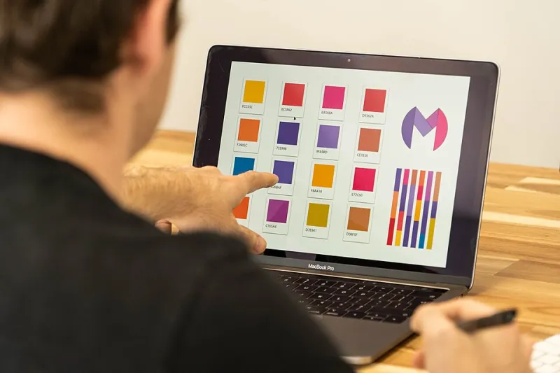
Hardwired for Harvest: How the Tools You Use Are Quietly Designing Your Creative Vision
Photo: Gordon F. De Lisle, Public domain, via Wikimedia Commons
Let's say you open up a fresh Photoshop document on a Tuesday in March. You're working on a client project — something light, maybe spring-adjacent. You reach for a preset filter, scroll through the defaults, and almost without thinking, you land on something warm. Golden. A little hazy around the edges. You tell yourself it just looks good.
But does it look good, or does it look familiar?
There's a quiet but persistent design problem hiding inside the software that creative professionals use every single day. The tools themselves — the filters, the template libraries, the AI generators, the stock photo ecosystems — have a seasonal preference. And that preference, more often than not, runs straight through October.
The Default Is Never Neutral
When Adobe built out Lightroom's preset library, they weren't thinking about subversive winter minimalism or the specific green-gray of a Pacific Northwest spring morning. They were thinking about what sells, what gets downloaded, what looks universally appealing to the broadest possible audience. And for a long time, that universal appeal has been coded in amber.
Look at the names alone: Warm Fade. Golden Hour. Vintage Glow. Dusty Sunset. These aren't just aesthetic choices — they're a seasonal curriculum. Every time a new designer cracks open the software and reaches for the defaults, they're being quietly taught that warmth equals beauty, that muted oranges equal professionalism, that the visual language of late September is the baseline from which all other work departs.
Figma's community template library tells a similar story. Search for "seasonal UI kit" and you'll find a disproportionate flood of harvest palettes, rustic textures, and cozy typography treatments. The spring and summer offerings exist, sure, but they feel like afterthoughts — often less polished, less downloaded, less integrated into the workflows that professional designers actually use.
This isn't a conspiracy. It's an accumulation. Designers build tools based on what's popular, what's popular reflects what gets made, and what gets made is influenced by the tools. It's a loop, and autumn is sitting comfortably in the center of it.
AI Generators and the Dataset Problem
Things get more complicated — and more interesting — when you bring AI image generators into the conversation. Tools like Midjourney, DALL-E, and Adobe Firefly are trained on massive datasets of existing imagery. And those datasets reflect the internet's existing visual biases at scale.
What does the internet love? Cozy coffee shop windows with rain-streaked glass. Leaf-littered sidewalks in the late afternoon. Pumpkin-spiced everything rendered in warm, low-contrast tones. These images get shared, saved, and pinned at rates that genuinely dwarf their spring or summer equivalents, which means they get fed back into the training data with disproportionate weight.
The practical result? When you prompt an AI generator with something vague — "a peaceful outdoor scene" or "a cozy workspace" — it reaches for autumn almost by default. You have to be specific to escape it. You have to know to ask for something different, which means you have to first notice that you're being steered.
For creatives who don't interrogate their prompts, this becomes invisible. The AI just seems to have good taste. What it actually has is a statistical lean.
Brush Packs, Texture Sets, and the Marketplace Effect
Beyond the big-name software, there's an entire ecosystem of third-party creative assets that shapes what designers produce — and it has the same seasonal skew. Browse any major design marketplace, whether that's Creative Market, Envato Elements, or Etsy's digital downloads section, and you'll find that the best-selling brush packs lean heavily toward organic, autumnal textures. Dry leaf edges. Rough bark. Watercolor washes in ochre and sienna.
These packs sell because designers buy them, and designers buy them because they look polished and professional in the context of what's already trending. It's self-reinforcing. Meanwhile, the designer who wants to build a visual identity around, say, the specific blue-white light of a January afternoon in Minneapolis is working with far fewer off-the-shelf resources.
That gap in the marketplace isn't just an inconvenience. It's a subtle form of creative gatekeeping. Certain seasonal aesthetics get scaffolded and supported. Others require you to build your toolkit from scratch.
Breaking the Cycle Without Breaking Your Workflow
The good news is that awareness is most of the battle. Once you start seeing the bias, you can't really unsee it — and that's actually useful.
A few practical moves worth considering:
Audit your preset usage. Go through the filters and presets you reach for most often and ask yourself what season they're encoding. You don't have to delete them, but knowing what emotional temperature they're set to gives you more intentional control over when you deploy them.
Build a seasonal reference folder. Before starting a project, spend ten minutes collecting reference images that match the actual season you're designing for — not the season the internet defaults to. This sounds basic, but it recalibrates your eye before you even open the software.
Get specific with AI prompts. Instead of "cozy home interior," try "bright Scandinavian apartment in February, cool blue-white light, minimal shadows." The more seasonal specificity you bake into your prompts, the less the tool's default lean will shape your output.
Seek out non-dominant asset packs. There are designers building texture libraries and brush sets rooted in winter starkness, spring freshness, and summer heat. They're just harder to find because the algorithm surfaces what's popular. A little digging goes a long way.
Treat the defaults as a starting point, not a destination. This sounds obvious, but a huge percentage of working designers — especially those under deadline pressure — lean on defaults far more than they'd like to admit. Naming that habit is the first step to changing it.
The Bigger Picture
This isn't really an argument against autumn. As a site literally named Autumn Pixels, we're not exactly in a position to throw shade at warm tones and golden-hour light. The visual language of fall is genuinely beautiful, and it resonates for real reasons — cultural, emotional, neurological.
But beauty shouldn't be a monopoly. The clean, crystalline quiet of a February morning. The almost violent green of a Midwest April. The bleached, overexposed flatness of a Texas July. These are real seasons with real visual identities, and they deserve creative tools that support them as fully as the harvest palette gets supported.
The pixel cycle — that loop of tools training designers who produce content that trains the tools — doesn't have to keep spinning in the same direction. It just takes enough creatives deciding to look up, notice the lean, and deliberately push against it.
Your software has a seasonal opinion. The interesting question is whether yours does too.