Grit Is the Point: Why Designers Keep Sanding Away the Best Part of the Season
Open any design tool right now and count the smoothing options. Blur. Gaussian. Noise reduction. Skin softening. Clarity slider dragged left. The entire architecture of modern creative software is quietly biased toward one outcome: surfaces that feel clean, consistent, and frictionless. Which is fine, until the season you're trying to capture is November in the Midwest, and November in the Midwest looks like a parking lot that's been rained on for six consecutive weeks.
The texture is the story. And most of us are editing it out.
How We Got Here
The texture-flattening habit didn't come from nowhere. It grew out of a very specific moment in design culture — the early smartphone era, when retina screens made grain look like a flaw and flat design became the dominant visual language. Smooth was modern. Rough was lazy. And that aesthetic logic got internalized so deeply that a lot of designers now reach for the smoothing tools on pure reflex, without ever asking whether the season they're working with actually calls for that treatment.
Summer, maybe. A sun-drenched beach shoot in July can support a clean, high-contrast polish. The light cooperates. The mood cooperates. But try applying that same workflow to a late October forest floor covered in wet leaves and decomposing matter, and you're not designing autumn anymore — you're designing autumn's Instagram filter. Which is a very different thing.
The real season has grain. It has fiber. It has the specific roughness of tree bark that's been through forty winters, or the crumbling edge of a clay pot left on a porch through a Texas freeze. That roughness isn't imperfection. It's information.
What Authentic Texture Actually Communicates
Texture in seasonal design does something that color and composition can't do alone: it triggers a physical memory. When a viewer looks at an image with genuine surface grain — the kind that suggests you could run your hand across it and feel resistance — their brain pulls from tactile experience, not just visual recall. That's a deeper engagement than color recognition.
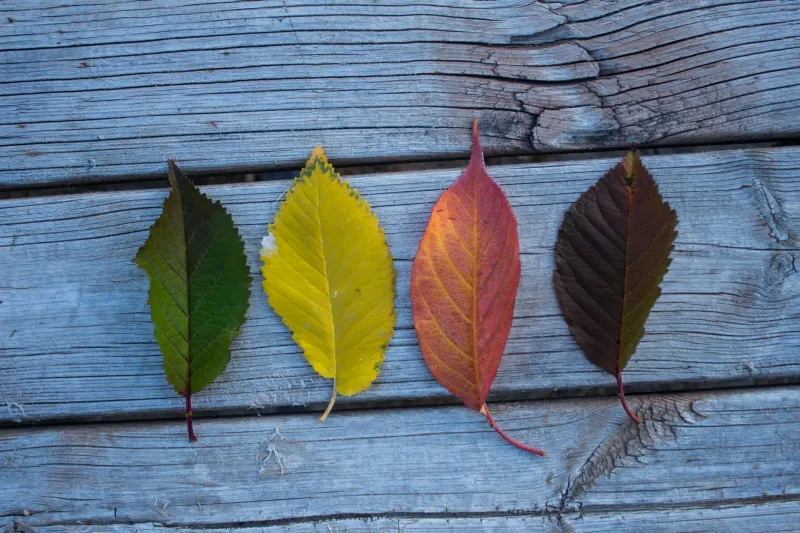
Think about the difference between a photo of fall leaves with the noise smoothed out versus one where you can actually see the dried veins, the micro-tears at the edges, the slight translucency where the leaf is breaking down. The first reads as "autumn." The second feels like autumn. That's not a small distinction when you're designing seasonal work meant to resonate emotionally.
The same logic applies to winter. Frost on glass has a crystalline structure that's genuinely complex — no two patterns are identical, and each one contains a kind of visual chaos that no smooth gradient can replicate. Designers who replace that texture with a clean blue-to-white fade are technically accurate but experientially wrong.
The Workflow Moments Where Texture Disappears
It's worth identifying the specific points in a typical design workflow where seasonal texture gets quietly removed, because most of the time it happens without any conscious decision.
During photo editing: Noise reduction is often applied globally and automatically, before anyone has considered whether the grain in a shot is actually doing visual work. A photo of a weathered barn in late winter light might have exactly the right amount of grain to feel cold and aged — and a default noise-reduction pass will strip it out in seconds.
During compositing: When designers pull elements from multiple sources and blend them into a single composition, the smoothing happens almost inevitably. Matching edges, balancing light, harmonizing color — all of these processes tend to soften the texture of individual elements until everything has the same surface quality. Which is the visual equivalent of putting a sweater and a piece of driftwood in the same room and making them both feel like fabric.
During final export: Compression, sharpening, and output-specific adjustments all have texture consequences. A file optimized for web viewing often loses the subtle grain that made it feel authentic in the first place.
Practical Ways to Put the Grit Back
The good news is that reintroducing texture is a learnable habit, and it starts with a simple perceptual shift: before you reach for any smoothing tool, ask whether the roughness you're about to remove is part of the season's character.
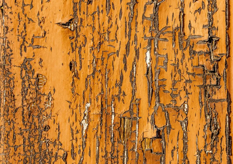
Shoot for texture deliberately. When you're out in the field — whether it's a trail in Vermont in October or a city block in Chicago in February — actively look for surfaces with age and wear. Peeling paint. Corroded metal. Cracked earth. These aren't background details. They're the season's fingerprints.
Use grain as a design element, not a correction. Adding film grain back into a composition at the end of a workflow is a well-known technique, but the more interesting move is using variable grain — heavier in the shadows and textured midtones, lighter in the highlights — to mimic the way real-world surfaces behave in seasonal light.
Let decay be visible. Rust doesn't have to be color-corrected out of existence. A rust stain on concrete in early spring, when the last of the winter salt is still eating through the surface, is one of the most honest visual records of seasonal transition you can capture. Leave it in.
Reference tactile materials. If you're designing a seasonal campaign and you're working entirely in digital tools, spend some time handling physical materials that correspond to the season — burlap, dried botanicals, raw linen, corroded copper. The memory of how those things feel will influence how you design their digital equivalents.
The Bigger Creative Argument
There's a reason the most visually memorable seasonal work — the editorial photography, the handcrafted packaging, the analog-inspired design — tends to carry texture. It's because texture is where authenticity lives. Smooth surfaces are easier to replicate, easier to scale, easier to mass-produce. Rough surfaces are specific. They belong to a place and a time and a particular quality of light.
When you design a season with its texture intact, you're not making something less professional. You're making something harder to fake. And in a creative landscape where AI can generate a plausible-looking autumn scene in seconds — smooth, competent, and completely devoid of any surface that's ever been rained on — the designers who know how to work with real, physical, seasonal grit are the ones whose work is going to feel like it came from somewhere.
The season demands rough. Start designing that way.